Exhibition – The Degree Show 2017

Plan

We have been tasked to plan and put on an exhibition of our FMP. We will be organising everything for the exhibition, It lies in our hands and it up to us to work as a team to put on a successful exhibition. We have got to find a place to have the exhibition itself, we have to fund it and host it. We will host the exhibition from 13th – 17th May. We will have an opening night on the 13th, in which we will be inviting lots of guests and family, we will be closed on the Sunday and then open 10-4 Monday through to Wednesday.

First Meeting

Minutes for the Graduate Exhibition, Wednesday 18th January 2017

Attendees: Alex, Becky, Luke, Beth, Taz, Lotty, Lottie, Ollie, Silva

Apologies: Charlie, Kitty, Rachel

Burton Brewhouse is fully booked for the year Ollie’s dad’s building is available for the dates we want and would be no or very minimal charge

Next Wednesday, 25th January, at 1:30pm it’s been agreed by the group that we will go down to the potential venue to have a look and take photographs- power facilities, utilities, toilets, wall space, health and safety etc. It was questioned about the availability of parking at the venue but came to the conclusion that there is a big car park a short walk from the venue Because there are tenants living about the venue we would need to advise them of our plans about the potential increase in noise on the Saturday evening (launch night). Tower Brewery has been contacted by Lottie about using their space as a venue and the response was that they are busy during the week and don’t open for the public (apart from a Friday evening which is used for meetings and receptions). We discussed the name of the exhibition but came to no conclusion as of yet

Actions: Ollie is to collect the keys for the venue for next week Lottie and Beth are researching into and enquiring about port-o- loo costs as the venue doesn’t have bathrooms

Visit the venue

Second Meeting

Minutes for the Graduate Exhibition, Thursday 26th January 2017

Attendees: Alex, Luke, Beth, Taz, Lotty, Lottie, Ollie, Silva

Apologies: Becky, Charlie, Kitty, Rachel

Discussion of the venue with the 3rd years and all were happy with being involved in the exhibition after seeing the photos. Numbers who want to be involved in the exhibition: 19 people for definite, 4 undecided

£570 based on the 19 for definite where everyone puts in £30

£690 based on 24 people where everyone puts in £30

£380 based on the 19 for definite where everyone puts in £20

£480 based on 24 people where everyone puts in £20

3rd years were caught up to speed with the dates, expectations of them, and if they were

to be involved in being at the exhibition during the week- it was put forward that a shift rota will be made with those that want to be there during the day. Discussed the issues with the venue- minimal power sockets, and lighting in the evening of the launch night. Potentially 4 or 5 people will need a source of power. Still awaiting responses from a small number of potential sponsors/funding.

Actions:

Find out if the 4 currently undecided want to be involved

Ollie is to get a confirmed price for the venue

Once there is a definite number of those exhibiting, we’ll begin to put together a budget

Costings/Budget

For the cost of the exhibition, obviously we had to cover it ourselves, meaning we had to put in a budget. We settled on £20 each. With us now sharing the exhibition with photography and fine art, there are 37 of us, giving a big budget of £740. We also decided that if they didn’t pay within our set deadline, they wouldn’t be displaying in our exhibition.

Name Picking

Screen Shot 2017-04-19 at 21.54.16

For name picking, we sat and all had input on what we fancied in terms of naming the exhibition. Everyone had a fair say in terms of the name and if they weren’t there to suggest a name, we gave them option on the group chat (above)

My name suggestion was Revolution, my reasoning for that is that we want to spark a new design concept, we all want to be different and stand out, hence the cliche that we want to start a revolution. According to a fellow student this name was already taken by a shop in Burton already. Although it doesn’t stop us from having the name, we want to be individual and when people feel they need to internet search us, they can find us easily and not find other stores such as the other one.

We eventually came to 4 names, in which we couldn’t decide a name between us, so we sent it to the group chat to see what everyone else’s thoughts were. We were left with ‘Things I’ve learned’, ‘Plug’/’Plugged’, ‘We’re all creatives here’ and ‘It is what it is’.

It took some time to really figure a name that fit with our exhibition, some of them were better because they kind of explained what it was and some, even though they sounded cool, didn’t really give away what it was, and this sparks fear because we will be having some attending who aren’t artists and won’t know anything at all.

In the end we completely scrapped the other ideas and decided we needed a more simple name, one that gave indication to people what we were doing and what our intentions were. That is when we came up with The Degree Show 2017. Although it is incredibly simple, It has what we want in a name, it tells the message before people can question it.

Posters

To get the exhibition off the ground and start letting people know of the dates its on, we need to start advertising it, so Becky and Alex came up with a few posters, in which we selected which one we liked best to represent us.

16442957_647889258749175_484878616_o16492324_647889178749183_932927855_o16507271_647889152082519_1439385662_n16558525_647889142082520_1994608484_n

These were Becky’s posters. Overall I like them but I don’t think they are what we need, we need something a little more exciting. I like the simpleness of the posters themselves, but in my opinion, because we have such a basic name for it (The Degree Show), we need a better looking poster to make it better, showing everyone that no matter the name, the exhibition itself will be great.

16409938_1362625670462903_992701916_o16442815_1362625700462900_133066020_o16443203_1362625697129567_287548218_o

These are Alex’s posters. I like these a lot better because they have a little more to them than Becky’s did. As I said before, Becky’s were just to simple and I felt like it didn’t really make our exhibition seem exciting. Alex’s are very vibrant in colour and straight away catch my eye. All 3 are great displays that perfectly describe an art exhibition in my opinion. The white and orange is a little more basic than the other 2 but because the font is big, it fills out the page and is eye catching for viewers.

More or less everyone, including myself have agreed that Alex’s pink poster is the nicest out of all designed. The glitchy feel to it makes it look very futuristic and exciting, it just catches your eye as soon as you look at it. Alex’s poster will now be adapted to fit our social media theming as well so we can start and promote, she will also be printing the posters soon, so we can start and advertise it to a wider audience.

Third Meeting

Minutes for the Graduate Exhibition, Wednesday 8th February 2017

Attendees: Alex, Lottie, Ollie, Rachel

Apologies: Becky, Charlie, Kitty, Silva, Luke, Beth, Taz, Lotty

Discussed the tasks and where we are, as a group, in regards to the plan

Finalised the Poster design

Finalised the numbers of exhibiters

Discussed and made brief sketches/ideas of how the space will look and how much space people will have to show their work

Discussed who we’d want to invite: creative staff and Chris Beech. The WhyNot Gallery, Hardy Signs, Ghost, Mayor, if invited could be given the task of choosing their own ‘best in show’

Rachel and Lottie to be curators of the show

Discussed giving out popcorn and/or having a confectionary cart there also

Actions:

Create social media imagery/ banners for Beth to launch the FB group/ any other social media platforms

Luke needs to start to look into and collect catering costs

Make and finalise a list of invites for the launch night

Venue

We have decide to have the venue of the exhibition at the building my dad owns with is on George Street (DE14 1DP). We decided to have it there for a lot of reasons. Number 1 is that is our own space and own freedom, we have no rules or regulations as to our work and what we are allowed to put up and not etc. Its going to be a cheaper cost, when we looked at other venues such as the Brewhouse, they weren’t cheap to hire out, with the place my dad has, because it is my dad he has offered us to it for lower, but we are waiting to find out a definite price for it yet.

Above all things, its easily accessible, easy to get to and the building looks really nice to hold the exhibition in, it tells its own story because its an old building.

We have so much space as shown in the pictures, so we really will have no problem having lots of work because we will always be able to find somewhere for it to go. The place itself at the minute is full of things because my Dad is planning on turning it into flats at some point late 2017/2018, so it will require some work from us to clear it up and sweep etc. to make it look nice for the exhibition itself in May.

Social Media

Screen Shot 2017-03-16 at 15.01.25Screen Shot 2017-03-16 at 15.02.10

These are our social media pages for advertisement. We have a Facebook page, since quite a lot of people are on Facebook, its easier to reach out to invite people to the event and take messages if anyone shows and concerns etc. We also have an Instagram where we will post photos of our progress such as work going up/being made and the exhibition itself. We think social media itself is really good when it comes to spreading the word on different events and news, so we thought it was important we had this up as soon as possible.

Fourth Meeting

Minutes for the Graduate Exhibition, Wednesday 15th February 2017

Attendees: Alex, Lottie, Ollie, Taz, Silva, Lotty

Apologies: Becky, Charlie, Luke, Beth, Rachel

Discussed the list of people to invite so we have a rough quantity of invites to get printed- looking at a maximum of 30

Is it worth getting a health and safety officer involved to help us through the risks so we have a professional perspective if anything were to go wrong- the issue with this is it could backfire on us and they might find too many issues with the venue.

It was decided by the group that we won’t go ahead with designing the catalogue for a few reasons:

Printing out design catalogues to hand to people on launch night will be very expensive (we’re looking at £30 per book, approx.). If it’s the case that others do want a book designed we should do it for the group and not for the public. We could still create a zine to hand out on launch night as they are cheap, quick and super easy to make. There’s only 2 weeks from our deadline date to the exhibition which wouldn’t be enough time to get the book designed, send off to the printers and returned before the 13th May.

It was suggested that we may need some one who is qualified in first aid at the exhibition launch night.

Lottie and Ollie went to speak to the photography group about finalising the numbers there and how much space they will need at the exhibition.

For our more important guests- i.e the studios, council, etc- it was suggested that we create a gift bag for them: zines, business cards, badges, totes, etc.

We talked about public liability and whether Lottie’s personal insurance would cover the whole group or just herself. When checking it appears as though it will, but we will need to wait until April 1st for the new policy- it might be worth pencilling in public liability in the budget just in case

Actions:

Take measurements of the venue

Plan out exhibitor space

Send off posters and invites to be printed

Fifth Meeting

Minutes for the Graduate Exhibition, Wednesday 8th February 2017

Attendees: Alex, Lottie, Ollie, Rachel

Apologies: Becky, Charlie, Kitty, Silva, Luke, Beth, Taz, Lotty


  • Discussed the tasks and where we are, as a group, in regards to the plan
  • Finalised the Poster design
  • Finalised the numbers of exhibiters
  • Discussed and made brief sketches/ideas of how the space will look and how much space people will have to show their work
  • Discussed who we’d want to invite: creative staff and Chris Beech. The WhyNot Gallery, Hardy Signs, Ghost, Mayor, if invited could be given the task of choosing their own ‘best in show’
  • Rachel and Lottie to be curators of the show
  • Discussed giving out popcorn and/or having a confectionary cart there also

Actions:

  1. Create social media imagery/ banners for Beth to launch the FB group/ any other social media platforms
  2. Luke needs to start to look into and collect catering costs
  3. Make and finalise a list of invites for the launch night

Generator

Me, Beth, Luke and Alex took a trip over the road from college to a company called Machine Mart to enquire about a generator to power our exhibition. We only needed it for a couple screens and lights just incase it went dusky/dark on the opening night. Beth spoke to the sales advisor, explaining what it was for and why we needed it. He explained that we were unable to actually hire them from there, they only sold them there. They ranged from £300 onwards. This was cutting into the budget quite a bit, especially with the public liability. He then explained about the generator itself, saying it would first of all need oil to power it. It is an extremely loud piece of equipment and the further away we placed it, the longer extension lead we needed. We then decided that it probably wasn’t a suitable option for us. With this being out the window, I confronted my Dad about the electricity. He said the building itself should have electricity when the exhibition comes around, meaning we will only have to pay for extension leads.

Sponsorship/Funding

16196864_1849017435312396_1501399010_o16244978_1849017438645729_1235217748_o16357918_1850956275118512_62638885_o17092917_1865422333671906_1535103582_o

These are some screenshots of emails sent and received to try and get sponsorship for our exhibition. Unfortunately, as it stands we haven’t been able to get any sponsors for the exhibition at all, with some ignoring our emails and some replying saying no.

We aren’t in desperate need of sponsorship, with the extra advertising like putting the posters up and word of mouth, I think we possibly have enough exposure to get us a decent turn out on the opening night and the other days to follow.


Printing Costs

Printing the posters was something that we had to look into more or less straight away, although we had a while till the event itself, being able to advertise it as soon as possible meant we could kind of round up numbers on who is coming and making sure people are free to come see it, especially if we had clients coming along to it.

The email above was a printing place that Becky inquired at. She managed to get an email response from them very quickly which was a positive sign. Only downfall with this company is that it is in Falmouth, where Becky has moved to, and with us needing the posters as soon as possible to get everyone involved, we would have to pay for postage and packaging. This isn’t ideal and we had to email printers closer to home.

Posters

These are our final posters that Alex managed to get printed from a place called Print & Digital in Lichfield. She was able to pick them up on her way to university so we did not have to pay for delivery etc. This also only cost £36, which was well within our budget. We then inquired about getting them put up around the college itself so fellow students can come along and see us.

17792724_10209904317263188_235045830_n.jpg

This is one of the ten that have been displayed inside the college facility, they have been evenly spread out around the college so a variety of people can see them and become interested in coming and seeing it.

Public Liability

To host the exhibition in our own space, we had to get Public Liability.

17453399_10207258156046884_406094163_o17474316_10207258156126886_5730789_o17474146_10207258156166887_180187246_o17474321_10207258156086885_836615523_o

Beth sent an email to inquire about Lottie already having Public Liability, but we had no response.

PUBLIC LIABILITY

This was our total for the Public Liability itself. It is a little higher than we first expected, we were originally expecting around the £250 mark, but because we went technically over 4 days because we are skipping Sunday we have had to pay more. Originally we all panicked because of it being so much, but because we hadn’t spent a lot of the budget, we were able to get it out of that with enough to cover the cost for other things we needed.

Display Boards

GETTING BOARDS 1GETTING BOARDS 2GETTING BOARDS 3

These are screenshots of Lottie’s emails to get the big white boards to display our work on. We were able to easily borrow the boards from the college, as this time of year they aren’t being used, its in June/July when the BTEC course will have their final exhibitions they will be used.

They delivered the boards Tuesday April 4th. Unfortunately I was unable to attend due to prior engagements, so I gave my key to Lottie, so she could let them in so they could unload the boards. They delivered 45 boards.

They then delivered the rest on Wednesday April 5th, in which we all went over to clean the space so we let them in to drop them. This only took them 3 drops and they were done early afternoon ready for us to put them up.

Layout

img_2462

This is our planned layout for our exhibition. Me and Lance went over to the exhibition to measure up and get the dimensions of the hall, so we could roughly figure out the amount of boards we will get in. We will have plenty of space to display enough boards that we need. Because it is our space this gives us freedom on where to place different people and different pieces of work.

Risk Assessment

RISK

This is the risk assessment that Charlie did. I had to go over with her to let her into the venue for her to make notes on the risks that our building holds. As far as risk assessments go, I truly believe this could possibly incorporate more detail into different things, this is very basic and just touches on the risks but not in great detail.

Cleaning

17797398_10207356090455183_1518178519_o17797566_10207356090415182_1080568529_o17797575_10207356090175176_1506447791_o17797966_10207356090255178_163984820_o

On Wednesday 5th April (when we got the boards delivered), we got everyone together and we all went over to the space and gave it a clean. From the first photos, it was incredibly messy, with stuff all over the floor. We managed to move everything into the back part of the building so it was out of the way and in no danger of getting caught up in the hall while our exhibition went on. We did extremely well in my opinion to tidy the space and to make sure everything was ready. We are going to return after our deadline to set up the boards ready for the exhibition.

Evaluation

Although it took a while with everything getting sorted, we managed to pull off a successful exhibition. Launch night went so much better than all of us expected, with a very successful turn out of around 120 people. Everyone eventually managed to get all of their work up, although we had to open up for certain people on days we didn’t plan, we eventually got everything sorted. We had a very good amount of feedback from our launch night, everyone really liked everything. First of all, everyone liked the venue that it was in. The building set off a great atmosphere for our work, with nice lighting from the big windows to finish it off. Everyone managed to find the venue with ease and find suitable parking. We had great feedback as well about our work, with some people wanting post it notes to write feedback about how good peoples work was. The food choice of popcorn was a great choice, every bag of popcorn was gone within the first hour. Most of the people, who came, came within the first hour, after that it started to die down until we finally finished at 9. The mayor came as well, which made the night a huge success.


As far as negatives go, there were a few issues more so with the building than anything. As the night started to go on, the room gradually became darker, even though it wasn’t pitch black, it was still hard to see some of the highlight features of peoples work. At the end of the night as well it became very cold, which made people not concentrate on the work and want to leave, but apart from that nothing went wrong and the whole night was a complete success.

Working as a group proved harder than we all expected. At the start of the whole project we were very organised and it felt like we were working entirely as a group. But as time started to go by, many people didn’t put effort in with it. Not only that but we were asked to share the exhibition with photography and fine art, which was completely ok with us, but you would have thought with them getting involved, they would have helped a little more, which they didn’t. Only a few of them helped us, the rest left it until the last minute to come and put their work up and it even resorted with a couple of people not even bothering, and we had to put the work up for them.

We had to continuously come down to the exhibition over the last couple of weeks before the opening night and only 5 of us turned up, and it was the same 5 people. No one else bothered coming down to help, which proved extremely frustrating for us because we put a lot more work and effort in than they did. Working as a team felt harder as well because I felt we weren’t listened to, apart from the normal 5 of us, we listened to each other but when it came to the other people , we weren’t listened to at all.

We had a huge problem with peoples work, like I previously said, they just didn’t seem interested in even bothering putting their work up. We set up and messaged the group saying that we needed people to put up their work on the Wednesday and the Thursday. This then spiraled out of control because people were saying about putting it up Saturday, so we agreed to open the building a couple hours before opening on Saturday. We then got some people who forgot and wanted to put up Friday and Saturday morning. This meant so much racing around for us and our planned 2 days went to 4.

Nobody seemed to appreciate the work that we went to (aside from the visitors), but those who set up their work came and put up their work and that was it, aside from paying the money to us, they did absolutely nothing at all.

We also had a job list for everyone to follow, so that we could get things done quicker. Me, Lottie, Luke, Alex, Beth, Silva, Lotty, and Tasleem all stuck to the jobs that we were set. Most of the other jobs were done, but badly. For example, we asked Charlie to do the risk assessment (she didn’t display in the exhibition in the end) and it was done so poorly and so basic that we had to re-do it in the end.

Apart from that, I felt like 5 of us worked well as a group and displayed great teamwork that was able to successfully make and put on an exhibition. I really enjoyed my experience with the exhibition and feel proud of my colleagues and myself for being able to pull it off. If I was to do it next time, rather than have to be placed in a group with people that don’t bother, I would choose my team wisely, because we worked so hard, with all of us dedicating unnecessary time to the exhibition when we should have been completing work instead. Overall though, I am pleased with how everything turned out, we had such an amazing exhibition, great turn out and feedback, which is more than we could have asked for in the end.

Portfolio of Professional Practice

Time Management

Time management is managing your time so your able to complete your work successfully in a certain amount of time. Since starting the BTEC course, even before it, I saw myself as a very organised person. I would always be ready on time and never late for anything. When I started, I wasn’t as organised as I thought looking back. I would never write down my intentions, I would never do specific work at certain times. I would always just do my work when I felt necessary, say if i had deadlines before others, I would complete them as quickly as i could to get them out the way with so I didn’t have to bother with them. Although I finished the course with a Merit, Merit, Pass, I can’t help but wish that I had been more organised because I probably would have finished with a better grade. Not being smarter with my time is a regret.

nPOWER

This was an example of my work on the BTEC course before I really payed attention to time management. The reason I don’t like it is because I wasn’t careful with my time management and I wasn’t able to submit it to D&AD like I wanted to originally.

Now I am studying for my degree, ever since the start of the course I have been a lot more organised than I was before. I always make lists as to what I need to do in a day and give myself targets of what I wasn’t to achieve in a certain time frame.

screen-shot-2017-02-02-at-15-10-06

This is an example of how my time management has changed quite a bit. This is my timetable for my current Final Major Project. It shows me organising how many weeks have and what work I should have done by certain weeks. Having this level of time management and organisation takes a big weight off my shoulders, it means my stress levels aren’t as high and Im able to do my work all ready for hand in.

Its improved in me making all the stops to make sure I have enough time for different projects, with me improving my time management and writing down what I need to do at certain times has improved my work rate and increased my grades.

I am going to develop it further by including time in my scheduling. At the minute, Im only putting dates weekly, but I never include time, I feel that if I include time, it would run even more smoothly than it does now. ‘When a brief comes in, even if the job isn’t due for weeks, look through the files straight away’ (Drew De Solo, 2013), This is something I can develop doing, rather than looking through it at a later date, look straight away to plan it and become more organised.

Funding

Funding is being able to provide money to make a project better or extend it further. When I originally started the BTEC course, I found it very hard to get a job, which made it really hard to fund projects. Luckily, more or less all of the BTEC briefs didn’t require funding unless we wanted to fund it to make it better.

CallofCthulu Mockup

This was a mock up of a book cover for the famous horror ‘Call of Cthulu’. Obviously, this never needed funding at all, no one on my course funded it, but I really liked my design and I wanted to look into printing it on leather. Not for the brief, but for myself, to keep in my portfolio of work, to show people. I felt like it would of benefitted me if I would have done, but I just couldn’t afford it at the time.

This was a couple of film posters I made for the film ‘Shaun of the Dead’. We were tasked to make a movie poster to sell at Burton Market hall. I made these and I had to fund it by paying for the printing cost, the framing and the paint I splattered on it afterwards to create the blood effect. This was a great project for us to do in my opinion because it gave us a taste of what funding is and what lengths we need to take to make our work more successful and better. I ended up selling both of these for £25.

My funding has improved by gradually doing more projects after this one with university, now because I have done so many, I don’t physically go into different briefs without making sure I have spare money for printing etc.

It will improve when I leave University, because of having to move down to London with my girlfriend because of her University, I will have to freelance to make money, so I will be having to fund different projects to sell and get some recognition for clients.

Teamwork

Teamwork is being able to work as a team to do a certain project. I would say I am really good at working as a team, I am a very easy going person who allows everyones opinions and I let everyone have a part in it. Even starting on the BTEC course, I have always been good at working in teams. When we first started, we had to do a couple of tasks as teams, in which I think I did well in.

Untitled

This was a group project we had to do called ‘Glow’. A pop-up shop in which we all had to sell a piece of our work. I thought we worked really well to be fair, I have never really had a bad group project. Although we worked very well as a team, It had its issues. One of my fellow students took a very demanding role and in my opinion wasn’t being very fair on the rest of us, not letting any of us have our own say, which in my opinion is damaging on a team project, we could of all turned away at any second because of the way we were treated, but we all obviously stayed and just put as much input in as we possibly could.

This is our upcoming end of year exhibition that we were tasked to organise ourselves. Although this hasn’t been completed yet, I already feel this has been 10 times more organised than our pop up shop. Everyone has had a fair input, we have our social media pages, we as a group are putting up the exhibition and have tidied the venue etc. None of this felt like teamwork in the first project because it was being bossed about by someone. This one has felt more free and although the venue belongs to me, I have given everyone a fair input in and also they have let me give my input, so I feel we are working tons better as a team.

My teamwork has improved drastically. Like my funding, it has improved by just keep attempting it more and more. Our first was admittedly lapse, but everyone learnt from mistakes and has made this more organised.

I will improve it by continuing team projects, I want the opportunity to do more so that when I leave and I will be working as a company, I will find no issue working as a unit. ‘Adding another person to your team can expand your skill set’ (Kate Moross, 2016)

Presentation Skills

Presentation skills is being able to present and talk about your work in a more confident way. I feel that on BTEC course it was harder to bring yourself to present, especially when we first started because we were all strangers and didn’t know each other. With that being said I feel like that was useful because we might get situations in future where we do not know who we are talking to etc.

Screen Shot 2017-04-19 at 12.18.52

This was our very first presentation that we did for the BTEC course. Its very plain and lacks information. This wasn’t a great presentation at all. I had no development apart from the small drawings in the corner, as well as that I can remember not being very confident in my talking and being very nervous so it effected me.

Screen Shot 2017-04-19 at 12.26.21

This is my guideline page that was featured on my final presentation BBC brief in the first year of university. This is just an example of how much change there has been since the first presentation. This page alone holds more information than my whole first presentation did. Although we did not present this to the class, from the presentations we did, I feel a whole lot more confident than I did at the start.

My confidence improved when I got a retail job in the second year of the BTEC course, it really boosted my confidence and I now feel I can talk to anyone.

I will improve it and develop it further by continuing, not only that but I want to start presenting in front of people I don’t know, so i can build even more confidence to present if I was ever to be put in that situation.

Research Skills

Research skills is being able to research work in a thorough way to understand work and make your piece better. On the BTEC course I never really researched a whole lot, I never realised how thorough you can be with just writing about work.

Screen Shot 2017-04-19 at 12.35.19

This is an example of research that I did on the BTEC course. This was one of the only pages I did of research. I never went into detail about the pieces of work, I simply said what it was and what I liked about it. At the time, I thought this was correct, that I should be researching this way.

Screen Shot 2017-04-19 at 12.40.35Screen Shot 2017-04-19 at 12.40.53

This is an example of research that I did for visual communication, In the second year of my university course. There is such a big difference in research between this and my piece above. First of all, I’ve split down into multiple subjects my research and I have made it as thorough as possible. It has over 5000 words, which is incredible when you compare it to what I used to do, obviously words aren’t a grade changer, Its the quality of the text itself but the fact I have that many words shows I go into as much detail and possible. Second of all, I have Harvard referenced every single piece that I wrote about, something that we have needed to do on the university course.

I have improved by going to every extreme of research to make my work at the best it can be, it really helps my work which is why I am happy to sit and research.

There is not a lot I can improve, I have done every element of research, including primary and secondary, but I could possibly look into doing more examples of research to make it even better.

Leadership

Leadership is taking a task into your own hands and suggesting/doing ideas to make it better. For me, it was extremely hard to get any leadership in on the BTEC course as we did not do many things as a group then, plus as well, with the group we were in, everyone had a fair say and there was never really a matter to argue or an idea to put forward that hadn’t been done. This changed a great deal when we started the university course.

With the group tasks being a ton bigger, this proved that if you don’t offer your say in situations, you won’t get what you want. Our very first group task (Glow pop-up shop, 2016) was very under control by one student, which is fine, leadership is obviously taking control of something, but it was very unfair because we weren’t aloud a say. I believe that to be a good leader you need to view other peoples opinions and listen to give a fair chance. This makes your project better.

This year we have our end of year exhibition (The Degree Show, 2017). So far even though we haven’t done it yet, I feel so much better about it than I did the other one. I had to step up and take leadership for the venue. Unfortunately we couldn’t find a space to display that fit our requirements. I then stepped up because my Dad owns a building that is ideal for us to use (3 George Street, Burton). Me stepping up as a leader for our exhibition is improving my leadership skills, something I will need because of wanting to set up my own business. Although I am leading the space of the exhibition and it is my own, everyone has their own say, I am listening to everyones opinions and giving everyone a chance. My leadership skills are good in my opinion.

To make them better, I want to have opportunity to do more, to organise more exhibitions, more events involving the public. Everyone had a say and a certain job for this and it has really made the organisation go a ton smoother than before.

Communication

Communication is built up of many things. Verbal, written and body language. I feel my verbal communication lacked slightly on the BTEC course. Verbal communication wasn’t my strong point back in college, I felt embarrassed to voice my opinion and ask for help on things when I needed it most.

In terms of written work, like in my research skills, I didn’t write a lot. I didn’t explain much to do with my work as I should of, my writing wasn’t very good and up to standard at all.

My body language back in college was also really bad. I never made eye contact when presenting, I would always slump and look at the screen. This is really bad presentation on my part and wouldn’t be acceptable on the level I am on.

All of my communication skills have gotten so much better on my university course. My verbal communication is more open, I am very confident when talking to clients and if i need help or I need to voice my opinion, I am not scared to at all. My written work has drastically improved, like I said on my research skills, I am writing a lot more and going into real detail to explain my work. My body language is a lot better as well, I am very confident in my speech, making appropriate eye contact with whom ever I need to, I stand up straight and rather than looking at the screen I present turned to the class with confidence and ease.

I will be able to develop my skills further when I am working and dealing with clients. I have already dealt with clients already, being confident in my speech, but I don’t do it very often and would like to take the challenge on a regular basis. I want to also get used to formal and informal language, I haven’t really had chance to do it much with not having many clients, but I need to get used to talking to clients in a formal way so I come across more professional.

Tech Skills

My tech skills range on a lot of software. To be fair, before I did the college course, I knew I wanted to do graphics and I was experienced with using Adobe Photoshop, Adobe After Effects, Microsoft Word and Microsoft Powerpoint. This helped me a ton, it meant I didn’t have to get used to all of them things when starting the course and it gave me a head start in comparison to other students.

It has improved because I have had to adapt to new programs as well, since the start of the course we have also had to use Adobe Illustrator, which I am very capable of using now since I have been using it since the start of the college course. We have also had to use Adobe InDesign to present our work also. As well as this, I have also developed skills in all programs I already knew, learning keyboard shortcuts.

I will develop this further by testing out new software. Adobe are always bringing out new software and since I have the monthly subscription, I can download at anytime just to try them out. Some of the ones I have tried include Adobe Animate and Adobe Character Animator.

Pitching

Pitching is being able to pitch an idea or plan. When we did the college course we didn’t really have to pitch many things, In year 2, we had to pitch our own briefs for our final major project. I would say I was never bad at pitching a plan, but I didn’t include everything that I should of done, going to the lengths of looking at everything including health and safety etc.

Screen Shot 2017-04-19 at 16.06.44

This is an example of my project proposal/pitch for a minor project we did at the start of second year in university. It goes so much more into detail than it did on the college course. This is probably the case because I didn’t do much pitching. This brief goes in to so much detail including funding, health and safety, target audience and costs. I am particularly proud of this pitch because of the amount I have done for it.

Pitching isn’t just this, Its also pitching ideas, something I had to do when we started to plan our exhibition (The Degree Show, 2017). I had to pitch my ideas of what to call it and where to have it, in which I had a really big say in. This type of pitching has also got better for me in university, because we didn’t do many team projects, I didn’t have to pitch anything before. I have improved it so much and I feel I can pitch any idea to any client now I have built up the confidence to.

I will develop it in future by pitching more ideas for live clients, when I leave university and also when/if we do an exhibition in future, I will be able to pitch my ideas with confidence and ease. Overall I am pleased with my pitching skills and to be able to improve it further in future will be a great skill to acquire, especially when I set up my own business.

References

  • Drew De Solo, 2013, Know Your Onions
  • Kate Moross, 2016, Make Your Own Luck

5 Year Plan

5 Year Plan.

This is my plan for the next five years of my life after I finish my second year of university.

Year 1 

For my first year, I want to stay on at Staffordshire University and top up my degree so I have a full degree and not a foundation one. Im looking to be able to maximise my potential by learning more and adapting to different styles so that when I do finish this year i will be able to work under any conditions for anyone. I want to be able to feel like i can do anything within graphics, so any piece of work. I want to feel like i can confidently go and get some work or even set up my own business. I want to develop my skills in freelancing a little more. I have done work for various clients in the past and i want to expand my catalog of clients so that when I leave university and do what else i have planned, i have freelancing to fall back on if i need any money at all. I want to be able to achieve my target of finishing the course and passing, I want my full degree and i want to have earned it. I also want to maximise my time at my part time job by taking on a new role. At the minute I am a sales assistant at Burton Menswear and although I have been given opportunity to do things such as set up and merchandise stores, I want to better my craft by taking on leader roles and possibly become a key holder. Being a key holder at work will allow me to adapt to a managerial role which is something i shall need experience for when I am going to try and become the owner of a business etc. Although clothing is obviously completely different to what I want to do, being able to be in the position of a leader will enable me to pick up experience and better myself to make myself perfect for that sort of role before starting up a business in the years to come.

Year 2

For my second year, I shall be travelling down and living in London with my girlfriend, I will either have left my job at Burton Menswear or had a transfer to the London store, depending on my options. My Girlfriend will be studying down there on an intensive course in Fashion, so I will be living with her. My plan is to try and get work experience there, just so that i have experience working in a bigger city in front of bigger clients. I will obviously quit Burton Menswear if an opportunity like this arises. Being able to gain work experience in London would really benefit me, enabling me to reach my full potential of work and say that i had experience in London on my CV. It will also create more work for my portfolio, and working with bigger clients will make my portfolio look a ton better. Failing the work experience, I will be looking to do freelance work down there and continue it from the previous year. With my book of clients being expanded and having more opportunity in a bigger place, I will be able to earn a reputation wether I am just work experience or a freelance, either way it will work. If i become a freelance it will enable me to work from home, which I don’t mind at all, but i just think being in a working studio would benefit me ,more and provide me with experience for when I am older and trying to set up my own business. It will also give me an idea on work rate and what things I will have to bare in mind to make my business a successful one. With my girlfriend being fashion based, if i am still struggling, i can gain experience from working for her clients and designing logos and stationary for small businesses if they want to set it up, even branding themselves is something I’d be happy to do, I can gain experience from that and money at the same time. Being there for a big period of time, I could even take a course down there to extend my knowledge in my craft, and learn some things that i may not have known before, or even take tutorials online on things such as motion typography, and get used to fields that i didn’t know a lot about/didn’t know at all.

Year 3

For my third year, I want to travel to America. I have had this ambition for a while now and i have been saving to travel since i started college back in 2013. I want to be able to travel the world and see it before i do decide to settle down later in life. I am wanting to visit as much of America as I can, wether that be hiring a car or flying to different parts of it when I need to. I want to explore the creative culture in America, I am fascinated by how everything looks In America, the layout of roads, the buildings on the roads, graffiti on the buildings, the designs of different advertisements and packaging and more. It is so different in America that it is here in the UK. Being able to discover the culture and meet people along the way will enable me to pick up on trends, such as what style is popular at the minute and why is it popular. I also want to try networking as much as possible. Being over there with no job and only a certain amount of money, means ill have a lot of spare time but will have to return at a certain point, so i want to make the most of it by meeting new people and potential clients. I also want to talk to companies, different design places that are either small or big. This will expand my knowledge even more and will be really interesting to learn about how different businesses work in different parts of the world. Being able to meet new people and explore art work and businesses somewhere that is new to me gives me essentially a confidence boost. It enables me to talk to different people and be able to know how to talk properly to client and various businesses that could even be a future employer.

Year 4

For my fourth year, I want to decide on where I shall be living in the future, wether that be here in the United Kingdom or if i see another place I like in the U.S.A etc. To afford a place I need to secure a full time job, so i will be spending my fourth year looking for a full time job that will secure me a house/place to live before i eventually set up my own business. Because i will be desperate job i will jump to any opportunity given to me, even if it was freelance just to get me on my feet i would accept it. Because i wont be rushing to set up my own business, taking this year to get a job and work on freelance etc. will give me more experience before taking it into my own hands and making my own business. Being able to gain better experience in a work place and adapt to the working lifestyle in my place that i decide to live. Being able to meet clients from doing work for different companies will be a big focus for me as well. Because i am wanting to set up my own business the year after i want to cram in as much experience as i possibly can. I want to be able to further my knowledge in different subjects of the creative industries. I want to use my spare time to take up and learn things like photography and video editing, so that i can get as much client work as i possibly can for every subject. Being able to pick up more skills and learn software that i didn’t know before can only work in my advantage, so when i do set up my own company, I can get work from any client  on anything and i wont be turning down a potential client because i do not know the software.

Year 5

For my fifth and final year i want to achieve my goal from this whole five year plan and that is to set up my own graphic design company/creative business. All the years previous were basically setting up for when i finally did make my business, and i was able to gain and cram as much experience for this over the past 5 years. My only real requirement for my business is that i want to set it up in a city, a big place that requires lots of work and that i can gain really good experience from just incase my business was to fail. Hopefully by this point i will have built up my contacts and will have a few clients that i could possibly do work for to get my business started up and out there. I will also make sure that myself and my studio are heavily represented on social media as advertising. I will be spending the year building myself up a portfolio, not only online but in physical form as well, so that clients who prefer a hand held copy to look at what work they will be getting can have one. Once i have decided where i shall be living i can decide where and who i set up my business with, My friend Alex who is a video editor and website builder said that he would make a company with me. On my level 5 course, we had to do a minor project and for mine i designed a website and Alex built it, It was for our custom company that we named Project Apollo. If i live in England and in Staffordshire, I am sure that Alex will set this company up with me. If I end up living in America however, I will either have to start one with people I have met previously or I will have to go alone and recruit from there. Either way, for my fifth year i want to make my own design company using the experience I have gained in my years before.

Here is my Action Plan for my five year plan, explaining my resources.

Screen Shot 2017-03-09 at 15.55.27


Final Major Project – Board Game

Hasbro board game

For my final major project, I am taking on the D&AD brief from Hasbro, which is to make a young adults board game.

screen-shot-2017-02-02-at-09-10-20

The brief is asking me to board game, to get an audience that are probably more into technology now back into board games. I need to make a party game, something innovative and exciting that will make people love games again and realise they aren’t to old for board games. I need to present my idea in a video, with a demo of the game itself and I also need to make a prototype of the board game. My objective is to make a diverse game that is unique and stands out as its own, maybe influence the 80s or 90s in it, just to make that audience more interested. I want to display it in my exhibition on a plinth/table and then have a bit board of the artwork behind the game, explaining briefly what it is and how to play it etc.

How people interact with the game

The way people interact with it is something I want to make the game special for. I believe that a good game invests people to not do anything else but play the game. Some games I have played I have been tempted to either divert or go on my phone etc, And I do not want my game to be like that. I can choose for my game to have just so many elements that the player can’t think of anything else but the game, or i could make a game that has a multiple job role, so each player has a different role in the team so they need to pay attention.

Gamification

Gamification is when a task, or a job is made into a game. It can be made into a game in ways such as offering a reward for finishing the task, scoring the task to achieve something and ruling the task to make it more competitive. This opens up so many doors to ideas of things to do. You can take something so boring that people hate doing and make people instantly want to do it by applying Gamification to it.

Materials

I will need to use materials wisely for my board game. I don’t want it to look cheap, i want it to look a professional standard, because many adults are serious game players and take everything seriously such as the artwork, the concept of the game and the sheer detail in them.  I want to add an element to make mine stand out, and the one I am leaning towards most is having 3D elements. Depending on what my board game is, I can use 3D elements for scenery etc. With all of this being said, its a party game also, meaning the detail is obviously something I still want but it needs to be a game that people have a good time playing and not playing it for competition so much.

Theme of the board games

Theming of the board game is very important in my opinion, its the first thing people see before playing the game, so it needs to stand out and needs to make people want to play it. Many competitive board games obviously have the best theming, because whoever made them spent a lot more time making the game stand out to an audience with its theming, then you have games such as Monopoly, that have the same theming and just change the pictures and names depending on the topic (Disney, Star Wars, Marvel etc.)

Board games (Research and Development)

Before doing any research on the internet, i decided to go to Toy Master, who sell not only mass produced games, they also sell games that are limited edition and made by guys who take competitive board games seriously. These photos show some of the board games i found there, some are recognised by most of the UK because they are everywhere and others that are selling for £75-£95 because they are really rare and limited edition.

I had a conversation with the sales assistant in Toy Master, who knew a lot of board games. He said ‘We sell an awful lot of limited edition games, which is why we get so many in, although the price may look steep, many competitive gamers buy these from us’. I then asked him what would he say makes a good board game, like what keeps gamers interested and want to play more, he said ‘I truly believe theming is everything behind a game, sometimes we have games in that look so good on the box i will put one behind for myself and thats all it takes. The Nazi game we have (Middle Left photo) is probably the best we have in at the minute, it involves history in it, which is interesting alone to any serious gamer. Gameplay in a board game is obviously just as important to, the game needs to be enough to keep players interested, some of these games we have, players play upwards from 2 hours, so as you can tell they are incredibly detailed and thought through. Finally i asked him if he had any recommendations for my party board game, he responded ‘I guess just think what can keep players invested. Think about theming, so make it interesting to your target audience and what they would like to see/play. Also think about gameplay, whats the trend now? what will keep people wanting to get together in a party to play your game? what games do you play now, take a look at what makes them so special.’

From my visit to Toy Master for my primary research, I learnt a lot about board games, Its help me to think outside the box with a board game and there is no limit on how unique i can get it, because there are so many games out there, such as the ones in Toy Master that are so deeply thought of and so individual. The sales assistant obviously helped out a ton as well, taking me through the details of the board games and how to make it special just like the rare ones they have in and sell there.

monopoly-board-game_nb7lyi

monopoly-art

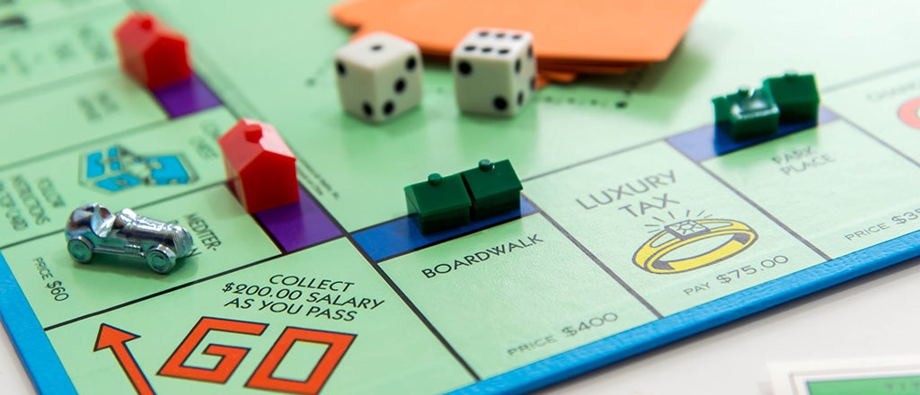
The most popular game worldwide, made by Hasbro is Monopoly. Monopoly is a board game in which players must play to buy different streets and property, collecting as much money as they can until they go bankrupt. There are so many versions of Monopoly that are available now, with the game increasing in popularity from its release, Hasbro have brought out more themes of Monopoly including Monopoly Millionaires, Monopoly Junior and Monopoly Empire (Hasbro, 2014). Monopoly is such a simple concept but can keep people drawn for hours. As a game, I really like Monopoly, I think it is a great game with a great concept and if i have time i really like a good game of it. With it being a very old game i personally think the design is a bit outdated, Its very simple and apart from it being a unique game concept, the design isn’t very unique at all. I want my game to have a unique design behind it, Although i like the simplicity, I want my game to have a bit more detail than Monopoly.

il_570xn-747956185_ee24

battleship

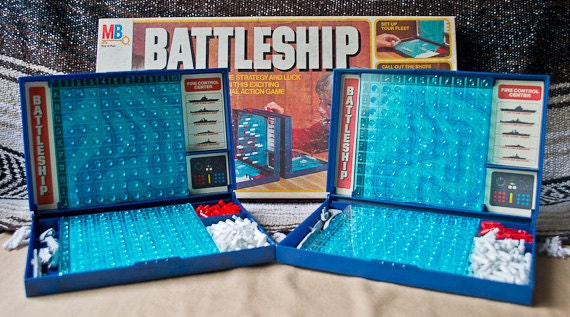
This is another popular Hasbro game called Battleships. Although this isn’t a board game, I included this in my research because of its very unique idea. Battleships is a very popular game, no matter the age everyone loves to play it (Hasbro, 2015). The same idea has been replicated and made more complicated in different spin-off’s but no game will beat the original Battleships. I really like the game Battleships, I think it is so unique. I love the design of the game itself, although it is very simple, i love the concept, i love how it folds into 2 carry cases to make it easy to put away, get out and carry to different places if need be. I would love to try and make my game so it folds into a carry case if possible, it will be very hard to try incorporate that into a board game.

photo-221

This game is called Cluedo, another made by Hasbro. Cluedo is a mystery game where you have to find out who is the murderer (Hasbro, 2015). Like Monopoly, Cluedo has had many versions of the game made over the years of success such as Scooby Doo, Harry Potter, The Office, Family Guy and more. As a game, I have never really played Cluedo, but i think it is a very good concept for a game, managing to challenge players mind and skill level. Although the board is detailed, I can’t help think that a 3D version would make the design more unique and detailed for the serious game players. The concept of the game is probably my favourite out of what I have researched, I think it is such a unique game idea.

img_0179trivial

This is the final Hasbro game i have researched called Trivial Pursuit. Trivial Pursuit is a very popular household game that tests players memories by asking them various topics of questions, until they fill in their circle. Many versions have been brought out of Trivial Pursuit, like Monopoly and Cluedo. Some versions have just specific question topics, then you have versions such as Trivial Pursuit Master, In which the board is bigger and the questions are harder (Hasbro, 2016). In my opinion, I enjoy playing Trivial Pursuit the most out of what i have researched, just because I like the element of being tested of my knowledge.

Out of what I have researched, I think all the games are very unique and diverse. Compared to each other, all of them are fresh concepts and ideas that are recognised worldwide. I have learnt that I want my game to be unique, have a fresh style and design to kind of update it with the trend, I want to incorporate elements such as 3D, to keep people invested and for big game players to want to play it because of the detail inside it. The hardest is obviously coming up with an idea for the game, what to do thats different, what to do that is attention grabbing, what to do that makes people want to play my game.

I have sketched down an idea i really like with help from my research that I did. My idea is to have a game that is set in the 80s/90s so that the older audience will already be more interested. My idea is to have it set in Downtown L.A. and have it like a cops and robbers format, so the cops are chasing the robbers from different points of the board. Have the board designed in a very retro, minimalist way like Berlin 82′ or Monument Valley (Because i love the way the graphics look on both of those, its the trend now). I could add the 3D elements by having either the buildings on the street 3D, or I could even make the road pop up like a highway so its 3D.

img_2542img_2543

Here are my ideas for the game itself, I can picture the logo being very retro style, a very bright pink/silver on it, making it look nice. I want it in a similar style design to Monument Valley and Berlin 82 (below) because i love the simplistic minimalist style they both have, I haven’t seen any board game with that style, only digital games.

image_12-1800x1000mv1

This game is called Monument Valley (Monument Valley, 2016) is a puzzle game app that tests players strategies with big 3D levels such as the 3 that are above. I love the design on this more than anything. All the colours fit in together nicely, the illustration itself is really nice. It has a very unique styled design which shows quite quirky but professional illustrations of the structure, very box like designs. I would love to have my buildings in this style, I would love for each of my buildings on the map to be detailed like this with different features on it to make it stand out.

berlin-82_8berlin-82_12

This game is a free indie game called Berlin 82′. On it you control a car in a hit and run styled game to try outrun the police. I didn’t know of this game until my tutor showed it to me. I love the concept and more importantly i love the design on it, with every building being unique in its own way, sticking to the same colour scheme and how simplistic it is. Like Monument Valley (Monument Valley, 2016), this one also uses the square shaped design which looks simplistic but looks very nice and unique in its own way. I want to have my board set out like this with the wide roads, buildings etc.

I have a problem with my idea in which I am struggling a lot with, and although i love my idea and concept behind it, believing in it being unique in every way, the brief specifically says it needs to be a ‘party’ game, and I don’t believe my game would really be suitable for parties. I have essentially got to go back to the drawing board and think about what i want. Do i want to keep the same idea but incorporate an element so its suitable for parties? or do i have to completely change my idea. Either way, i am adamant in keeping the same design style and having the 3D elements on it.

I am going to adapt my idea and try and still make it. I need to think as to what people play at parties and how i can incorporate that within my original idea.

screen-shot-2017-02-09-at-14-34-50screen-shot-2017-02-09-at-14-34-59screen-shot-2017-02-09-at-14-35-08

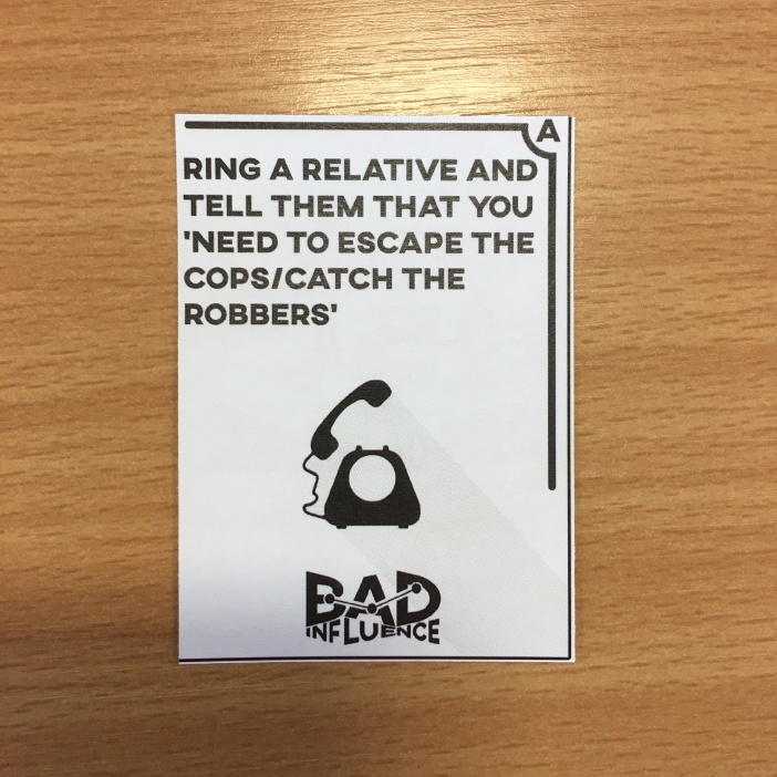
These 3 board games i found from the brief itself, it listed a few games that we could look at to gain inspiration and since i need to make this a party game, i will be taking a lot of inspiration from them. The first is called Obama Llama (Obama Llama, 2017). It is a rhyming game in which to win you must figure out the riddle/rhyme that includes a celebrities name on it. It is an insanely good idea for a party game that keeps people engaged and having fun. I really like the idea of the game, but i want my game to be a hard party game, i want people to get frustrated to win. The second is called Bucket of Doom. Bucket of Doom is very similar to Cards Against Humanity in the sense of there is a card czar that decides the funniest and winning person. The objective is to decide the funniest way to avoid dying. It looks like a good game, but i can’t help but think its just a replica of a game that already existed. I want my game to be as unique as i can possibly make it, its going to be hard because there are so many but i will try. The last is a game called Exploding Kittens. It was a game that blew up in the world of board games. The game was a kick starter project made by 3 guys to try and get $10,000 to  produce the game. The game ended up drawing a huge $8,782,571. The card game is very similar to Russian roulette, but with a kitten instead. The aim of the game is to be the last one left. You can counter the kitten exploding with certain cards that are picked up by individual players. This is a very cool concept for a game and i really like how it incorporates a game that is played in real life. I think this is really unique and would like to make a game like it. Overall, i really like all 3 games and i think they are excellent examples of what i want my game to be. All 3 have elements to make them great and successful games and the inspiration from them is helping me think a little more.

img_2607

This is some idea generation that i did to decide an idea that will make a good party game. My idea was to incorporate an already existing game that wasn’t a board game, similar to Exploding Kittens (Exploding Kittens, 2017). My idea was to somehow incorporate truth and dare. I then wrote some of the requirements that the brief was asking me so I can think about what i could do and what i couldn’t do. One of the biggest was the age range, and I needed something that would keep people invested and want to keep playing, this is where truth and dare becomes harder to do. At the same time, I wanted to keep it unique, and although it obviously wasn’t much of a party game, I really liked my planned theming with the retro L.A scene and the cops/robbers style.

img_2608

This is further planning into my game. I have decided to stick with the same theming, wether that be I take the whole idea or just part of it I don’t know. I am looking to incorporate cards over a board with my idea, so I am coming away from using a board when the brief said we didn’t have to if we did not want to. With my idea having the cops and robbers incorporated with it, It will be 2 teams, one of cops and one of robbers. My idea involves having scenario cards, that will tell a story of what is happening during the time of the bank heist. The goal is going to be that cops have to catch the robbers, or the robbers escape.

img_2609

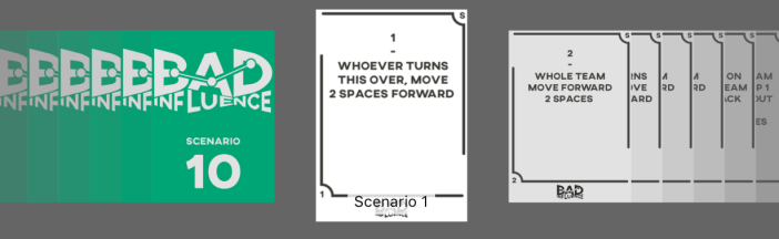
My idea is to have the 2 teams (one cops, one robbers) and 10 scenario cards, turning over all of them will complete the game. The action or moral cards are something that people have to do, and if they do, they will continue turning the cards, but if they dont or they fail it, they must pick up a consequences card that will have a punishment or something that will hinder the players progress underneath. Researching further and jotting down ideas definitely helped me but i feel like the game is basic, I feel like it needs more to make it more complex and harder, so people can have a long game and want to keep playing.

img_2758img_2759img_2760

This is my new idea for Bad Influence, the board game. It features a big board with squares that players must reach the end on, it has action cards, consequences cards and scenario cards. I like this idea more, it has more of a story behind it and with my interactions, it makes the players more invested and want to play the game. I like the idea of my scenario cards only being turned over when the game tells you to, which makes it last a lot longer than it would before. Most importantly, I have turned it into a party game, a fun game that will make people laugh and want to play as well as being competitive and hard to win.

img_2761

I am developing my board game even more, to make it more unique. I have decided that i am going to stick with the same cards (action, consequence and scenario), but i am making the board a map now. I am going to feature a couple of different boards with maps of big cities on, where bank heists would actually happen. I am going to make the maps on wood, and engrave the paths where players can go. If i can try scale the map to a perfect size, i can have the players use cars, down the engraved bit. It is going to be extremely hard to do, and it will take a lot of time, but I am willing to spend the time as long as it will be unique and make people want to buy and play the game.

img_2762img_2763

I am planning to do my board in a circular shape, which will feature multiple cities such as Paris, Milan and London. Im going to have the circular board made of wood, engrave the roads so that the players can get their counters down there also. I really like my new idea, I think it is really unique and stands out compared to other board games. It also fits in the theme, me using big cities as maps fits in with the robbers doing a bank heist. Im going to have to look at scaling, and how much I will have zoom in so the smaller roads are acceptable.

85d7134690-444074cnc_wood_engraving_machine_with_mult_headscustom-wood-engraving-image3

I am going to have to use the laser cutter facility at my university to make the board. I need to make deep and big cuts so people can go put their cars down their and move them properly.

121e08adb4e0460408d5e15ccaa68b7c

poster_1024x1024_7c3a17c0-26e7-4f18-b891-543c809efce9_1024x1024

I want to make the logo very simple yet retro style to fit in with the design of my game. My game design is minimalist, so i need a logo that will fit into that style. I wanted to do a retro looking logo but it wouldn’t really go with my theme.

screen-shot-2017-03-02-at-15-06-38

screen-shot-2017-03-02-at-15-08-30

I want to create exclusive cars that players can use as their counters. The cars need to be minimalist like the ones i have researched above. I want the cop cars to be similar to the one above and i want the robbers getting away in a fast looking car. I love the look of the cars that candy land have made because they look really nice, they look really minimalistic and simple, which will go with the design of the game.

752e1e9bcf664a1707f9a1e77303d0a563ef236dc2d12bfaced7e5b7827f368c35006153fae7550150830d4900b4664f

These scale circular maps are the sort of thing I want to be using for my boards. Im going to have to look into scaling them more so that the thin roads will fit a little car down the engraved bit. With my research looking at the maps, its going to take me a while to get the scaling right as well as the wider roads and the engraved bits. I need to also find a way to make the board spaces, for fair playing, so i need a wide enough space to draw the spaces on. Ive also included the London illustration, although i am keen on the idea of using the big real maps like the Paris one, I love the simplicity of the London one, with detailed illustrations of certain landmarks which is a great idea. Now onto my games logo.

Screen Shot 2017-03-08 at 15.00.55

I originally wanted my game retro, when I initially came up with my board and the cops and robbers idea, I was going to go retro. I new what style logo i wanted which is why I came up with this one. But because of it focusing more on the map element, and I love the Monument Valley design, I have decided not to go with the retro logo and go with a more square minimalist design. I really like the logo itself, but it just doesn’t fit with my game.

Screen Shot 2017-03-08 at 15.01.36

I then decided to do just a big board full of different font logos and play about with different icons. I really like the bolder fonts, the ones that look sleek and more professional. I really like the outcome of all of them, some have a text style that tells more of a story as to what the product is, and some I have added different icons to symbolise what my board game is about and to make them instantly recognisable for the audience.

Screen Shot 2017-03-08 at 15.03.44

This is the one my final logo, the one i decided to use. This one has a very clean bold looking font which is easy to use, It also features map points across the top to make the board game more recognisable and kind of gives away what the game is and the point of it. I really like this logo over all the others that I came up with, I just think it looks more unique also, I have never seen anything like it on a board game before, but it still looks professional.

IMG_2775IMG_2776IMG_2777

This is the design for my different cards. I mocked up one card and printed it off to see if the size was ok. The sizing for the card itself is perfect in my opinion, Its clear and easy to read and hold. I asked everyone on the degree what opinions they had about them. I was told to centre the text instead of having it to the side and use the the red backs for the consequences because of the colour being quite an angry colour. I will centre the text on my cards and I think i will have the action cards become blue, so I have the colours of sirens on the board.

Screen Shot 2017-03-15 at 11.46.21Screen Shot 2017-03-15 at 11.46.43Screen Shot 2017-03-15 at 11.46.59

I have just finished my final cards for the game. These packed cards are my Action, Consequences and Scenario cards. All have a different colour on the back so they are easy to identify when playing the game and if they get mixed in with each other by accident. I went with the blue on the Action card to represent the police uniform and kind of stick with one theming throughout the game. I chose red for Consequences so that the Action/Consequences cards are like sirens, also red is a very dark colour, it represents failure which is what I want my consequences card to be, I want them to have a huge impact. The colour green kind of represents peace, like its almost a relief to have it and all of the scenario cards will help the team, so I wanted to represent it in a relaxing way.

IMG_2809IMG_2810IMG_2811

These are my instructions for the game. I have decided to just go as in depth as possible but at the same time make it simplistic for those reading, because not a lot of people bother with instructions when playing games. I have decided to highlight words in some ways wether that be in caps or underline, just important details that players of the game need to know before they start playing. I am happy with my instructions and I think i have detailed everything that I feel is necessary, so now I just need to design and make it.

Screen Shot 2017-03-30 at 11.56.57Screen Shot 2017-03-30 at 11.57.09Screen Shot 2017-03-30 at 11.57.21Screen Shot 2017-03-30 at 11.57.30


Here are some screenshots of my final design for my instruction manual. I tried to make the design as simple and easy to read as possible, because not a lot of attention will be payed to the Instruction manual. I decided to do it on A5 sized paper and I will have it on two pages, so its small and not using a lot of paper. I continued the same theming, with the dark grey colour and the same font. I am very pleased with the outcome of this, It is exactly what I wanted from my manual, professional looking and simple as well.

IMG_2812IMG_2813IMG_2814IMG_2815IMG_2816IMG_2817

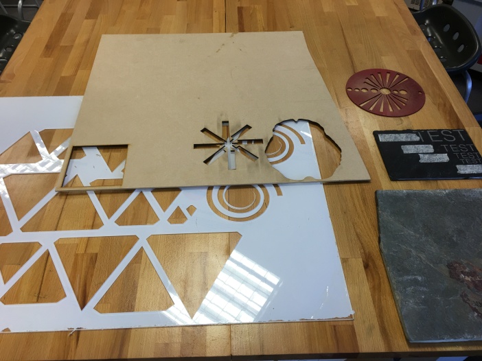
These are some different materials that can be used on the laser cutter, where I will be making my board. Here we have just plain wood, perspex and slate. I like all 3 materials but only one will cover what I need, the other 2 will be no benefit for me. Perspex wont do me no justice because of it being thin, with me needed a lot of cutting out it could possibly crack in certain smaller areas and is easy to break by accident for people using the board carelessly. Slate is a very nice material and would make it very unique, but is not suitable for my needs, its very hard to cut deep into it, but also its very heavy, which makes it not practical at all. The wood is my best bet. I want a thicker piece than the example displayed in the picture, but also I need it in a circular shape. I will finalise it by maybe sanding the hard sides down so its not sharp, and I will stick a piece of thick card or thin wood underneath to draw the spaces on. Overall I am happy with the wood and will start to use the laser cutter to make my board soon. As well as that, I will need to look at how I can create packaging to keep my game in, but I will do that when I have made the board so I can know definite measurements and what I need to put in it.

In order to make my board as successful and perfect as possible, I want to experiment how the laser cutter will work, how deep I will have to go and how long it would take me to do it. I cut an A5 piece of the map out and laser cut it into the wood that I wanted when I researched.

This is my experimented wood. I cut it at 1mm, to see is it would hold a counter. It is a suitable depth in my opinion because it ables people to move their counter with ease and not get it stuck. My only real disadvantage is the road size, because I complete pen tooled the Paris map, some roads are bigger than others. So this means I need to make the counter fit the smallest road, meaning it will fit all the others. Failing that, I can block off the smaller roads so players have to go around, making the game even harder. Also, the players will have to take out their counter to move it to different roads in different directions. Overall I am really pleased with the outcome of the experiment, its a really ideal depth for what I want and the wood looks really nice. I want my board to then be circular, and I will sand down the sides to make it smooth all the way round.

IMG_2885

This is my final board being made in the laser cutter. I have got the sizes perfectly to fit 2 boards on an A2 sheet of wood.

IMG_2886

This is just being touched by the laser cutter to mark it, this will help me because I am going to cut straight through, rather than engrave like I experimented with because it took to long.

IMG_2887

This is the final cut of my mark up board, and the start of the laser cutter engraving my board, In which i will take and glue down over my first marked up board to make the board more deep and less flimsy.

IMG_2888IMG_2889IMG_2890

These are the final pieces. Both have turned out great, but unfortunately I accidentally didn’t join up the line of the road to the edge so it will get cut off, meaning I had some pieces still joined together, which isn’t an issue, I will rip the edges to glue it down and re-cut around my board to give it a smoother edge.

IMG_2891IMG_2892IMG_2897

This was me gluing it down to the final board, overall the whole process took about 5-6 hours to get it completed. The cutter itself only took about an hour but then gluing it down proved to be very tricky as I had to make sure every piece was perfectly placed. After the glue dried, Its made it very secure and unmovable, which I am really pleased about because it won’t break easily.

After testing the width between different roads, I have got a rough size and I will be making cars as the counters on the 3D printer. As well as cars, I will be making the buildings to represent the bank and the police station, to be placed on the players choice.

Screen Shot 2017-03-30 at 13.23.20Screen Shot 2017-03-30 at 13.23.30Screen Shot 2017-03-30 at 13.23.39Screen Shot 2017-03-30 at 13.23.50

These are some models i found online (thingyverse, 2017). These are very ideal for what I am looking for to include on my board game. They are all an ideal size and will look nice along with my board game. Both of the cars are a retro style and are very minimalist which will suit my board game. Both the buildings are easily representable as either a police station and a bank and will make great additions to my board when in play. Now I just need to print some buildings and cars like this through the 3D printer to go with my board since it’s complete.

IMG_2959

This is me re-cutting my board in the laser cutter. Since it came out a bit wrong because of my pen tool lines not exactly reaching the edge, I re-cut it to give it a smoother edge. This proved to be a very long process because my A2 block around it wasn’t square, so we had to keep moving it slightly and testing it to make sure it was centred. Overall this took about an hour, which was a lot longer than first expected. It came out a very clean cut in the end and looks really nice around the edge now, making the game seem more professional.

IMG_2961IMG_2962

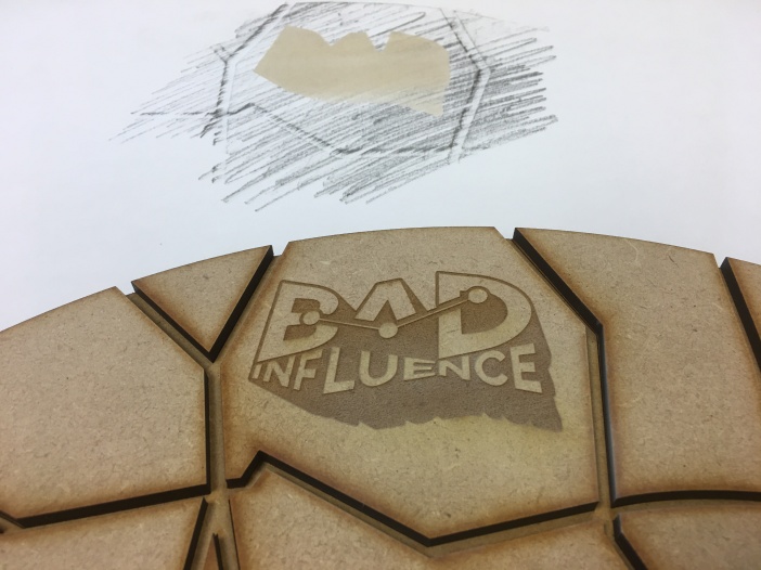
The next job I wanted to do was to engrave my logo in to the board, just to give it a little extra, the board is very plain itself and I feel it gives it more of a professional look to have the logo on there as well. We tested the logo placement first because when we marked up the box, it looked like I hadn’t scaled it right. We tested it on a piece of white paper, where we sketched over it in pencil to see where my box was, we then had it touch the paper as to where it would go. Turns out the scaling was perfect and on the first attempt managed to get it spot on where we needed. The reason the laser created a shadow on the paper was because I accidentally doubled the layers. We then engraved the board itself. It has come out really nice, but by accident, the doubled layers weren’t removed on the bottom of the A, so it came out without them on. I decided to still keep it, in my opinion it still looks really nice, the rest of it came out better than expected and although they are missing, it doesn’t look bad and people can still tell its my logo.

IMG_2963IMG_2964

Because of the 3D printer proving very time consuming, and my deadline soon, I decided to just make my characters out of wood instead. This is a shame because the 3D printer would have looked great on them, but timescale wise, I didn’t have enough time to be using that facility. I decided to layer some pieces up in which I would glue together in sequence to create a car to use on my board. As well as that, I also printed out the 2 roundabouts I was missing from my map before.

IMG_2965

These are my playing cards, I printed them on A4 double sided matt card 200msg. They turned out very nice and look professional and exactly how I wanted them. The only issue we had was the back design. Because the printer I used wasn’t a double sided printer, I had to print one side and put it back in the printer to print a second, this meant that if i was to go with my original back design, they wouldn’t be level with my front card design. So to save time and a lot of effort with different techniques, I changed my back design to a patterned logo with the name of the card on. This still looks really nice and professional, I am very pleased with the outcome, now I just need to attempt to cut the cards as nicely as I possibly can do.

IMG_2966

This is me gluing together my car. Because the characters are so small, fiddling with them trying to stick them down proved impossible so I had to get rid of some bits, including the wheels. Now I have a square, the base and the rod to guide it. It doesn’t look bad without that, and you can tell their purpose so I am happy with how they turned out, my only concern is how thin the rod is, it might be very fragile when playing the game but I won’t know until I test it later on.

IMG_2967

These are my final Scenario cards. Because these are reward in a scale, I needed these to have the numbers on the back more than anything, but with the printer not being double sided I couldn’t do much about it and had to stick with the pattern. Because this was the case, I had to print off some numbers to indicate which card is which for the players. Although it doesn’t look really bad, I wished i could have done these more professional looking and maybe found a different technique for printing, but they proved incredibly time consuming and I had to stick with this option. I think they still look nice and don’t look particularly unprofessional, its just an indication for the players.

IMG_2968

These are my final counters and buildings. Although I didn’t go with the 3D buildings, I have gone back to how I said I wanted my game and that was minimalistic. The characters are very simple but look great, same with the buildings. I am really pleased I managed to achieve what I set out. I also managed to pick up these sticker dots from Ryman’s which helped indicate which team is which (red=robbers, blue=cops) without spending time painting them. I think they look professional still as well, because underneath the colour of the stickers you still have the wooden counters, which I like about it because they match my board. I am happy my board is wooden, it gives it a vintage game feel rather than being made of plastic like every game is now-a-days.

IMG_2970

This is me testing the board game with my family to make sure everything worked. Everything worked really well and we had a great game. The game was fair, we played 2 rounds where we took it in turns being different teams and both cops and robbers won 1, meaning it was a fair game. The game was more importantly fun, we all had a laugh playing it, which is exactly what I wanted. This game is so suitable for my target audience because to win the game you just nee to be as stupid and crazy as you can be. I am so pleased with how everything has turned out to this point, everything looks great and it all works better than I ever thought it would do. I am going to keep testing my game as much as possible to make sure it ran as smoothly as it did the first time.

I decided to varnish my board, to give it a darker texture and to make it stand out a bit more. In my opinion, the MDF made it look very bland and simple, just this simple coat of wood varnish has made it look a ton better already. The darker look makes it also look more professional to a player, It takes away the idea of it looking homemade, which was something I don’t want, I want it looking as professional as possible.

Screen Shot 2017-04-25 at 21.33.27

I am having to now look at packaging for my game. At first since it was only a prototype, I wasn’t going to do a box because the brief didn’t require one. I thought it might look better if I did just make something to store it, even if it isn’t much, just something to store it will make it look more professional. This website (Templatemaker, 2017) enables you to pick a box and type in the dimensions you need to make a template. You are able to save it as a pdf and print it if you need to. Since my board is already A2, the box template will need to be twice/three times the size, so instead, I didn’t print it but I used the pdf to measure and draw it myself.

To start, I picked up a sheet of cardboard which surrounded a door sold by a D.I.Y store. The sheet was given to me by the store without having to pay, so my packaging is the only thing that is free so far. I had to measure the box according to my board. I marked it in pencil and measured it with a small ruler and a tape measure. I used sharp scissors to cut it out with, unfortunately we don’t own a stanly knife, so my edges aren’t as clean cut as they would be if I used a stanly knife. I used the scissors to score the edges and fold them over to create my box. It all fit together flush and I have not had to edit it further.

Overall, I am very pleased with the outcome of my box, it is everything I wanted in a box for my game, with its unique opening and style, I have never seen a board game with a box like mine. It is extremely simple yet looks professional in my opinion. It took around 4 hours in total to make the box for it. My only issue with it is the jagged edges, especially at the front where you can really see it. If I was to do it again, I would have it either professionally made or use a stanly knife to keep it a clean cut edge. Even with the jagged edges, in my personal opinion, I don’t think it looks bad at all. It looks smart and professional to hold my board game in and keep it protected. I had to resort to making the box myself and not through a company because of the size of my board, it is a very awkward size and I couldn’t find any company around here that would make that size. I would have to go further afield and that is not possible with the deadline coming soon. I managed to find a couple of white boxes to hold the cards and the characters in. I then wrapped the boxes and the board in bubble wrap so it doesn’t move around in the box and is protected. I also used foam wedges that I found in an old laptop box to protect the edges of the board, to keep it stable in the box and to generally make it look more full, and like it has been packed like a professional board game.

Target audience

My target audience is from 16-26 year olds as set by the brief. This audience is hard for the brief that I have been set because that generation has been taken over by smartphones and technology, trying to pull them away from that is very hard. I need to make my game so good that people will want to play it, people will want to put their phones down and just play an old school board game, which is why I had the retro idea.

Hasbro

hasbro-2zmbdtz7he73fkj249xr0q

Hasbro (The company the brief is for) is a billion dollar toy/board game company that is based in the U.S. They are home to some of the most popular games and board games in the world today. The company was founded by 3 brothers in 1923. In order for my board game to be even nearly as successful as theirs, I need to really focus on the professional aspect of it and make people want to play it/buy it like they do their products. (Hasbro, 2016)

Schedule

screen-shot-2017-02-02-at-15-10-06

This is my schedule for my final major project. I will be sticking to the schedule as much as I can, because i believe that time management will help me not stress about things so easily. I believe I can do it well within my schedule and use my organisation and time management to finish this project with no problems.

Final Design

IMG_3060FullSizeRender 3

I am really pleased with my final design, it has taken a lot to get to the end and I didn’t think it would be possible, especially with me having to change to a party board game but I managed it. I got every piece that I wanted, I have managed to make my prototype as professional as possible and I am proud of the way it turned out. This is the longest I have spent on a piece, it took countless hours to try and make it, as well as adding little features such as the logo to the board and the cover sleeve. I have managed to make the box more practical and look more like a board game by making little holes in each side to hold the counters as well as the dice and the cards. This took a bit of time because I had to measure every hole and cut with a knife. With me having a knife at the college, I also managed to clean up the jagged edge of cardboard as well. It came out looking really nice and I am proud of how it looks, it looks like an actual board game.

The sleeve finishes off the box nicely without me having to decorate the box entirely, something I didn’t want to do. I think that decorating the box would have been a long process, especially with not having a great deal of time. I was going to wrap the box originally and spent time looking around the house for something to wrap it with. While looking, I stumbled across an old game box that I had. The game was in a cardboard tray, and was wrapped with a cover to keep it protected. This was a quick, easy and professional method of making a box and I quite liked the idea. I went to the print bureau and managed to get a sleeve printed straight away. It took around half an hour with about 5 minutes to carefully glue it together. I am pleased with the outcome, my game looks very smart and the box/cover make it look more professional.

Evaluation

I made a board game for Hasbro as part of their brief they set on D&AD. I felt like I needed/wanted to challenge myself to the best of my ability and take on a brief that I wouldn’t usually do. By doing this I am able to gain experience and further my knowledge into new things, so I have the experience when I am older and working for clients.

I researched quite a lot into board games that Hasbro had created and looked into what makes them so popular. They are very fun games to play, people continue to play them even to this day because they are addicting and fun. They have unique ideas so I needed a unique idea that really stood out and made people want to play it over and over again. I needed something that stood out like the rest of the Habro board games, meaning I needed to get extra research and look into different ideas to stand out. As I started to develop a little more things became clearer as of what I wanted to do. I researched into styles, and I settled with wanting to do a minimalist style. Minimalist is very popular now and since my board game is directed at 16-26 year olds. The minimalist style also looks very clean and professional, meaning that I would have to work to the best of my ability to make it look simplistic yet professional at the same time. When searching what to do after I settled on a board, I came across several maps, which is when I decided to do a map based on Paris. This was my key to making my board game more popular, it was very unique and eye catching. Although it took a lot more work to make it more successful, it looked so much more unique which is something I wanted more than anything.

Production took quite a while. There were several elements of my game that had to be done professionally, meaning I had to carve out time (when they were free) to go to the University’s print bureau and make it. Several of my hours were spent in there completing my work. I had to do my board, characters, cards and box sleeve in there. Over all, the board took the longest, with the testing of the MDF etc. After the testing, I had to laser cut my board, glue it all together and then re-cut it around the edge with my logo engraved on it afterwards. It took a very long time, even longer due to the fact that I had to wait for staff to use the laser printer and they were very busy. My cards were something that I was able to print off by myself on the professional printer in the print bureau. The characters were cut at the same time as the board so I simply had to glue them together when I recut my board. I made the cardboard box at my house in which I had to measure and cut it all. Finally, the sleeve was done at the University’s print bureau with help from one of the staff members who printed it for me before I scored it all and glued it to fit over the box.

There were a few issues that occurred during the project itself. The first (and biggest) was my change in idea. I had to adapt because my original idea wasn’t really a party game. I had to step up and change my idea around to make it more like a party game. This obliviously involved me applying a ton more time into research to see what was the best idea and making mind maps and brainstorms to get a better idea. Another was time spent in production. Like I have mentioned before, there were quite a few days in where I had to leave doing anything to my board because a staff member wasn’t there to supervise the and set up the laser cutter. I had to just solve it by keep going back as much as I can, I kept having to check on a daily basis to see if they were free. Eventually I was able to go print off my things and make it all. I also wasn’t able to use the 3D printer because of it taking to much time and staff not being free, so I had to resort to making them out of the same wood that I used for the board game and I made them when I re-cut my board around the edge. I had to re-cut my board around the edge because my roads at the bottom of my map didn’t join at the edge, so I had to recut to make all of the roads lead off the edge of the board. When I engraved my logo on the board, the bottom of the A’s layers doubled up, meaning the machine didn’t recognise it as a path and it didn’t print it. There wasn’t anything I could have solved about this one really aside from completely re-doing the board, so because it didn’t look that bad I decided to leave it. Although I had my issues with the board, I am proud with the outcome of it all.

I think my strength in this brief was having a great knowledge about board games already. This enabled me to have a great creative mind on what I could do my board game about in my opinion. I was able to think of an idea and make it into a board game. It wasn’t easy but I had a lot of fun coming up with an idea and making it into an actual design. Another strength is obviously being the middle age of my target audience and regardless of research, I already have the knowledge of what people my age like, what they will do, what they wont do, what they will play etc. Another strength is organisation, I am a naturally organised person and especially with me having a schedule made as well, I was working very organised. With my organisation skills (apart from using the printer/laser cutter) I was able to do everything when I wanted to enable me to meet the deadline. My definite biggest weakness for this project is using the laser cutter. I walked into the brief not knowing how to use it, which meant I had to have a staff member helping me at all times, which wasn’t great for my time management, but with that said, it has turned into a strength sort of because I have learnt how to use it and would be capable of using it in a future project.

I have picked up several new skills while doing this project, some that I already had but I have adapted to make them better. I picked up the skill of being able to properly adapt an idea to make a project better. By this I mean having to make my game into a party game. I was able to pick up the skill of laser cutting, something I have never done before, which was hard to get right and took time but in the end I thought I made a good job of it. I managed to pick up the skill of making boxes, although its not much, I was able to use a net template and draw it out on a big bit of cardboard and successfully make a nice looking box for my board to sit in. This is a handy skill for future reference because in case I have to make boxes in the future to hold different work in for clients. I was able to adapt the skill of working to a professional brief set by a big company. I had to do this last year where I did a brief for BBC. I was able to develop my skill by gaining more experience when taking on the Hasbro brief and working for a big client, I had to make my work as good as I possibly could to impress a client like that. Finally, I was able to get the new skill of being able to make the board game itself, although I am a huge fan of board games, I have never made one before so having that opportunity to take that on was really good, but I gained skills to make one in future if I ever got tasked to by a client.

It has helped me progress in huge amounts, not just academically, but professionally and creatively. It has helped me academically by giving me experience of working on a big brief for a bigger client, having to work to the best of my ability, where I was pushed to my limits and worked harder than I ever have before. I was able to progress professionally by yet again working for a client; I felt that my work was a great professional example, with me going to extreme lengths to make it and spending a lot of time and money on it. I was able to make my work look extremely professional and like it should look when working for a client, this is progress because from now on, I will be using this project as example and will be doing everything, spending money and times to make my project look as good as possible. It has helped me creatively because I have experimented with materials and machines that I have never used before, I had to use MDF, a material that I have never used before and I also used the laser cutter. I have progressed in this because it makes me want to play about with more materials and experiment with the laser cutter more, which I have more knowledge in now.

I like everything that I did for the project, I really like how everything turned out, I believe it looks incredibly professional and like it is an actual produced board game. I can improve my project in future by having a set idea; I lost a bit of time with having to make it a party board game. I also lost time because of there not being staff able to set me up and watch over me with the laser cutter and the printer. I would say I could improve this in future by learning how to use them, which is fine with the professional printer, but I doubt I will be able to use the laser cutter myself because of it being a health and safety hazard. One thing I didn’t like about my project was that I didn’t have time to get my cards printed professionally, not that they turned out badly, but they weren’t as good as I wanted them to be and I felt they could have looked a lot better if I had them done professionally through a company. Overall, although I had a few things that I would improve in the future, I really like my project and how everything turned out, I am really pleased with it.

In a national context, my game fits in. Hasbro is a huge company worldwide and is very recognized in the United Kingdom because the board game market is brilliant over here, with many people actually going to toyshops just to play different games. My game is different because of its unique layout and individual set up. There are no games in the United Kingdom like my game that display that kind of a board of a certain place, and as far as I believe, there is no games with the same concept as mine. It stands out because of the board, the use of the map as a board and the wooden based board. It is statistically proven that ‘70% of the United Kingdom use social media’ (wearesocial, 2017). My aim of my board game is to try and get people off social media and playing my game, so with my game being extremely different and unique, I’d like to think that I am keeping the interest of the users and they will want to play my game rather than go on their phones.

In an international context, the board game community extends quite a bit, mostly in the USA. My board game fits in internationally because of the country based element, people might feel more interested that the game is based off a real place, and if there was even extension maps, they might be further interested. My board game is different because of it having a very demanding type of gameplay. In the UK this is ok, because I feel people over here will shed more time in an interest, while worldwide they are very social media active and are always on their phones. It stands out because of its style, the design of the board itself isn’t like anything released international, and in the UK we have a big board game scene, like I researched primarily. It is statistically proven that ‘71% of the world use social media’ (wearesocial, 2017). This is a huge statistic in itself and it might be a lot harder to get an international audience interested in my game rather than a national audience.

The national audience would probably be more interested in my board game than an international audience. This is because there is a smaller amount of people nationally and as well, we have a better board game scene in the United Kingdom, with people interested in playing homegrown and made games.

Overall, I am extremely pleased with my project, everything I have done I am proud of, I have managed to complete it all and I have met the deadline that I was set.

References

Res.cloudinary.com. (2017). [online] Available at: http://res.cloudinary.com/dicetowernews/image/upload/v1468017378/monopoly-board-game_nb7lyi.jpg [Accessed 9 Feb. 2017].

-Knowledge.wharton.upenn.edu. (2017). [online] Available at: http://knowledge.wharton.upenn.edu/wp-content/uploads/2016/02/monopoly-art.jpg [Accessed 9 Feb. 2017].

-Janmary.com. (2017). [online] Available at: http://www.janmary.com/wp-content/uploads/2013/12/photo-221.jpg [Accessed 9 Feb. 2017].

-Img1.etsystatic.com. (2017). [online] Available at: https://img1.etsystatic.com/057/0/9580453/il_570xN.747956185_ee24.jpg [Accessed 9 Feb. 2017].

-Kickdes.files.wordpress.com. (2017). [online] Available at: https://kickdes.files.wordpress.com/2011/04/battleship.jpg [Accessed 9 Feb. 2017].

-Resiliencefitness.com. (2017). [online] Available at: http://resiliencefitness.com/wp-content/uploads/2013/09/Trivial.jpg [Accessed 9 Feb. 2017].

-Godisageek.com. (2017). [online] Available at: http://www.godisageek.com/wp-content/gallery/trivialpursuitmasteredition/img_0179.jpg [Accessed 9 Feb. 2017].

-Usweb-cdn.ustwo.com. (2017). [online] Available at: https://usweb-cdn.ustwo.com/ustwo-production/uploads/2015/07/image_12-1800×1000.jpg [Accessed 9 Feb. 2017].

-Qichen.newmediadl.com. (2017). [online] Available at: http://qichen.newmediadl.com/files/2015/06/mv1.jpg [Accessed 9 Feb. 2017].

-I1-games.softpedia-static.com. (2017). [online] Available at: http://i1-games.softpedia-static.com/screenshots/Berlin-82_12.jpg [Accessed 9 Feb. 2017].

-I1-games.softpedia-static.com. (2017). [online] Available at: http://i1-games.softpedia-static.com/screenshots/Berlin-82_8.jpg [Accessed 9 Feb. 2017].

Google.co.uk. (2017). Google. [online] Available at: https://www.google.co.uk/webhp?hl=en&tab=ww#hl=en&q=hasbro [Accessed 9 Feb. 2017].

Google.co.uk. (2017). Google. [online] Available at: https://www.google.co.uk/webhp?sourceid=chrome-instant&ion=1&espv=2&ie=UTF-8#q=monument+valley+game [Accessed 9 Feb. 2017].

Google.co.uk. (2017). berlin 82 – Google Search. [online] Available at: https://www.google.co.uk/search?q=berlin+82&oq=berlin+82&aqs=chrome.0.69i59j0l5.2309j0j7&sourceid=chrome&ie=UTF-8 [Accessed 9 Feb. 2017].

-Google.co.uk. (2017). Google. [online] Available at: https://www.google.co.uk/webhp?sourceid=chrome-instant&ion=1&espv=2&ie=UTF-8#q=hasbro+board+games [Accessed 9 Feb. 2017].

-Hasbro.com. (2017). Hasbro Games | Hasbro Gaming | Hasbro. [online] Available at: http://www.hasbro.com/en-gb/brands/hasbrogames [Accessed 9 Feb. 2017].

-Google.co.uk. (2017). hasbro board games – Google Search. [online] Available at: https://www.google.co.uk/search?q=hasbro+board+games&espv=2&biw=1280&bih=581&source=lnms&tbm=isch&sa=X&ved=0ahUKEwifncnny_HRAhWrK8AKHQATBhUQ_AUIBygC#tbm=isch&q=hasbro+&imgrc=IYvNJbRkQm4bpM: [Accessed 9 Feb. 2017].

-Hasbro.com. (2017). [online] Available at: http://www.hasbro.com/en-gb/brands [Accessed 9 Feb. 2017].

-Twoam.agency. (2017). [online] Available at: http://www.twoam.agency/hello/wp-content/uploads/bfi_thumb/hasbro-2zmbdtz7he73fkj249xr0q.jpg [Accessed 9 Feb. 2017].

-En.wikipedia.org. (2017). Hasbro. [online] Available at: https://en.wikipedia.org/wiki/Hasbro#Hasbro [Accessed 9 Feb. 2017].

-Bigpotato.co.uk. (2017). Big Potato. [online] Available at: http://bigpotato.co.uk/obamallama [Accessed 9 Feb. 2017].

-Bucketofdoom.co.uk. (2017). Bucket Of Doom. [online] Available at: http://bucketofdoom.co.uk/ [Accessed 9 Feb. 2017].

-Kickstarter. (2017). Exploding Kittens. [online] Available at: https://www.kickstarter.com/projects/elanlee/exploding-kittens [Accessed 9 Feb. 2017].

-Google.co.uk. (2017). wood engraving – Google Search. [online] Available at: https://www.google.co.uk/search?q=wood+engraving&hl=en&biw=1280&bih=625&site=webhp&source=lnms&tbm=isch&sa=X&ved=0ahUKEwi76tuk9rfSAhXsD8AKHVLtA5UQ_AUIBygC#hl=en&tbm=isch&q=wood+etching&*&imgrc=lu3k1cytacvWXM: [Accessed 2 Mar. 2017].

-Candylab Toys. (2017). Stinger – Candylab Toys. [online] Available at: https://www.candylabtoys.com/collections/our-cars/products/product-four [Accessed 2 Mar. 2017].

-Candylab Toys. (2017). CPC – The Candylab Poster Collection – Candylab Toys. [online] Available at: https://www.candylabtoys.com/blogs/candylog/85864070-cpc-the-candylab-poster-collection [Accessed 2 Mar. 2017].

-Pinterest. (2017). Retro Thin Line Badges and Logos. Vector Pack. [online] Available at: https://uk.pinterest.com/pin/425590233520911189/ [Accessed 2 Mar. 2017].

-Pinterest. (2017). Paris carte Estampe – ville carte affiche. [online] Available at: https://uk.pinterest.com/pin/548735535834130415/ [Accessed 2 Mar. 2017].

-Thingiverse.com. (2011). Antique Car by RobbinsvilleHighSchool. [online] Available at: http://www.thingiverse.com/thing:6197 [Accessed 30 Mar. 2017].

-Thingiverse.com. (2013). Police Car by P6619. [online] Available at: http://www.thingiverse.com/thing:172538 [Accessed 30 Mar. 2017].

-Thingiverse.com. (2014). Epic 40k Gothic Building – Long by SgtShellback. [online] Available at: http://www.thingiverse.com/thing:217827 [Accessed 30 Mar. 2017]

-Thingiverse.com. (2012). Paris Building by MakerBot. [online] Available at: http://www.thingiverse.com/thing:30649 [Accessed 30 Mar. 2017].

-Templatemaker.nl. (2017). Template maker. [online] Available at: http://www.templatemaker.nl/ [Accessed 25 Apr. 2017].

David Carson – How He Impacted Graphic Design

David Carson By Olly Ward


In this essay I will be researching David Carson, a well-known graphic designer who has changed the industry.


David Carson is a very well known graphic designer who was born in Texas, United States in 1955. Carson’s work has varied over his years of becoming a designed but he is probably best known for his magazine design, which is very unique and innovative. Carson had previously studied a degree in sociology before starting to experiment with graphic design and from there; he gained a bit more education within the industry.

Carson began when he became an art director of a magazine company called “Transworld Skateboarding”(Davidcarsondesign.com, 2016). A company that Carson then found his specialism in, he completely changed the company, giving them an edge to other magazines due to the style of his cover. The cover had quite an edgy, non-perfect design, which was distinct and eye-catching to the audience. This then became “Carson’s signature style”(Famous Graphic Designers, 2016), that he then became very recognised for having.


In 1992, Carson was hired to design “Ray Gun”(Davidcarsondesign.com, 2016) with publisher Marvin Scott Jarrett. The “Ray Gun magazine was a life style and music magazine”(En.wikipedia.org, 2016) that was first released in 1992. It had a very unique representation with Carson’s diverse cover designs and people brought the magazine not only for the content but also brought it because of Carson’s cover designs as well. Carson designed the first 30 issues of “Ray Gun”(Davidcarsondesign.com, 2016). His type and layout made him stand out as a figure in the graphic design industry. His style was unlike anyone had seen before, so this lead to Carson’s increase of popularity, with his unique design method.


In 1995, Carson departed from “Ray Gun”(Davidcarsondesign.com, 2016) magazines to then make his own studio, which is based in New York City. With his rapid popularity from his diverse design, David gained quite a few clients such as Levi Strauss, NBC, American Airlines, Nike, Pepsi and more. While in his own studio, David named and designed a tourism magazine called “Blue in 1997”(En.wikipedia.org, 2016), for the magazine he designed the very first issue and from there he did the first 3 covers that it had. The first issue cover design is in the Top 40 magazine covers of all time list, which is made by the “American Society of Magazine Editors”(designboom | architecture & design magazine, 2016).


Carson still to this day is an influential designer in his own right; he still is active on social media showing his pieces of work. He revolutionised graphic design and showed how being different matters. He solely created and got over his own individual style, which people still use today in their work. His style and take on the art industry as a whole is a huge influence for myself; it’s just so inspirational the way he took the design world as a whole. He conveyed a message through his own design work and completely changed graphic design for the future.


He changed it in such a way that it sparked a new revolution in the design industry. Design at the time was seen to be very professional and sleek looking which “was high demanded”(En.wikipedia.org, 2016), so when Carson stepped in, “he broke the rules”(designboom | architecture & design magazine, 2016) in a way, which got the design industry to look at his work in a different way, making him such an influential designer. Carson’s designs stepped over the edge to what was popular at the time, he infused art with design and brought that edginess to design that was only ever seen in art before that time. He played by his own rules and showed the industry that difference is good, and this could of lead to the amount of different design techniques we have to this day.


He broke the rules in the design industry, by proving that change is good. The professional look that companies originally wanted was on high demand especially at that sort of time, where design sort of took over the world. His “unique take on art”(En.wikipedia.org, 2016) changed the work of many other people. While everyone was offering this professional look that everyone wanted at the time, Carson offered a different more unique design, where he would incorporate artwork. Carson’s influential work first came along when he was working for “Transworld skateboarding”(Davidcarsondesign.com, 2016), where he stepped up his artwork on the magazine to display a much more edgy looking piece. I think Carson is even part responsible for giving the skate industry its own individual look, because if you look at any skate magazine to this day, it always has an innovative, unique design, that sets it off by itself. You can almost tell what is to do with skating and what is not just by looking at the design that is used.


Carson completely changed the industry in such a way that it enforced a new design perspective and made it more eye-catching for a bigger audience. In my opinion, he changed the design industry completely for the better, with his edgy unique style if definitely captivated a different audience. People weren’t bored of the professional element a lot of the designers had at that time, but they needed change to attract different customers, which was when Carson came in. Not only would it have made the industry demand for that work but also it made a lot of people want to become designers. With the professional look being in high demand at that time, it was obviously a very specific thing people had to produce and a few people were not very good at that. When Carson came along and introduced that style of art, it opened a lot of doors for artists who wanted to be designers but couldn’t do the professional look in their work. David’s passion for the industry drove a lot of people to share that passion with him and popularise the art process, rather than professional side to design.


The normal design at the time was professional, companies were in high demand of a professional look to make their business/work place stand out and look professional to compete with other industries. The sleek design brought many clients because all big companies at that time had a very professional look about them; everything they had was professionally done. Everything to do with the branding, the logo, letterheads, leaflets, posters, pretty much everything a company had, had to “look professional to gain clients”(designboom | architecture & design magazine, 2016). When Carson came along it completely changed industry design, and companies requested work more like Carson’s because it stood out more compared to the professional look people had previously been requesting. With Carson’s work, such as the work he did for “Ray Gun”(Davidcarsondesign.com, 2016), it brought out a bigger audience for being different and caught the eye of every client. This success rate then brought very big clients Carson’s work like I previously noted. With bigger companies using Carson’s work, it helped to popularise that style even more, and everybody wanted it. This is why it revolutionised the industry in such a big way, because of the high demand, making “Carson an iconic figure in graphic design”(Famous Graphic Designers, 2016) today.


His style “majorly conflicted”(Famous Graphic Designers, 2016) with standards at that time. The standard at that time was very sleek and professional like I mentioned earlier, everything was done to perfection. Every industry pined for a professional look to obtain a wider audience, they believed that with a professional look, they could sell something for a better price because the company looks professional, which I do believe my self, but at the same time, Carson’s style for me makes a company stand out more in a unique way. You still see a lot of professional companies with professional looking graphics such as logos, store graphics etc. But Carson’s style has impacted industries in a big way and loads of company’s worldwide use his style. The main line of business that uses Carson’s style is the skate industry. When he did his magazine, Carson sparked that sort of style in Skateboarding and it is still used today in magazines, on skateboards and on skate clothing.


Carson’s work relates to modernism, which is an art or movement that aims to change from the traditional forms. Carson’s work is a huge example of this as he completely broke the rules to achieve his standard of work. He modernised our industry and sparked a new era of design that engaged an even bigger audience towards it.


Here are some examples of Carson’s best and most iconic work, which changed our industry.

1

This is “Transworld Skateboarding”(Davidcarsondesign.com, 2016) where Carson became an art director. As you can see the cover has a very grunge, “dirty”(Famous Graphic Designers, 2016) feel to it compared to others. The text ‘skateboarding’ at the top is bold and in a bright colour, it is the emphasis of this cover. The issue title has a text that makes it look like handwriting, Carson’s style was very edgy and the fact that the cover didn’t look professional shows it. The cover is topped with an image of a guy doing an Ollie down a gap. The image is quite dark and it looks like it has motion behind it as the lights in the background aren’t clear.

2

This is also a cover for “Transworld Skateboarding magazine”(Davidcarsondesign.com, 2016). This is a very unique cover and probably my favourite out of all of the covers he did for “Transworld”(Davidcarsondesign.com, 2016) Magazine. The cover represents shadow. Again, like the last cover, the emphasis is the word skateboarding, which on this cover is also a different colour but is in the exact same place. The cover features a skateboarder in black and white filter, with a black shadow underneath him, the cover then splits off into 2 sections with a black strip running up the right side of the page. The “Transworld”(Davidcarsondesign.com, 2016) is separated into 2 colours, with the black on white and the white on black, which I think is really clever and eye-catching.

3

This cover is for “Raygun magazine”(Davidcarsondesign.com, 2016), who he was hired to design magazines for in 1992. It’s within this company that Carson’s work really took off and he started to get noticed as a artist with a different style, which was very unique. This cover of “Raygun”(Davidcarsondesign.com, 2016) features a guy stood in a shadow with sunglasses on. At the top of the magazine is the title of the magazine in bold lettering, which Carson used to always do with “Transworld skateboarding magazine”(Davidcarsondesign.com, 2016). The contents of the magazine are kind of spread in a unique style, kind of like a code or something. I like this magazine cover because it is very eye-catching and unlike anything you would usually see on any other magazine. Another thing to note is that the cover is eye-catching and Carson didn’t even have to use any colour on the front of it.

4

This last cover is also done for “Raygun”(Davidcarsondesign.com, 2016). “Every title of Raygun magazine was designed differently”(designboom | architecture & design magazine, 2016). This one featured a very bright photo of people. Carson designed this cover with the colour scheme blue and orange, as you can see on the people and in the writing/background. This is a very complicated design, which is what I like about it. There’s a lot going on at once and this is what made Carson’s work take off.


Visually, Carson’s work compared to what was normal at the time is very unique. At that time with the professional standard, everyone tried to become a designer and only use professional techniques, Carson pushed that boundary and showed that you can use any style you want, you are still capable of making a piece that is eye-catching to an audience, hence the reason he drew such a big mix of clients with the likes of Levi’s, Pepsi and Nike.


David Carson took graphic design into a complete new revolution when he released designs like these. It’s a very unique design and I hold it as a big inspiration to my work. He changed the industry for the better by introducing a new style, which proved that any style is a good style, and there are many more fields of design to respect and love, instead of a professional sleek design all the time. As a graphic design student myself, I see his work as an inspiration to me, and his success through the industry.


Bibliography:

– Davidcarsondesign.com. (2016). david carson design. [online] Available at: http://www.davidcarsondesign.com/ [Accessed 30 Nov. 2016].


– En.wikipedia.org. (2016). David Carson (graphic designer). [online] Available at: https://en.wikipedia.org/wiki/David_Carson_(graphic_designer) [Accessed 30 Nov. 2016].


– Davidcarsondesign.com. (2014). magazine | david carson design. [online] Available at: http://www.davidcarsondesign.com/t/work/magazine/ [Accessed 30 Nov. 2016].


– Carson, D. (2016). Design and discovery. [online] Ted.com. Available at: https://www.ted.com/talks/david_carson_on_design [Accessed 30 Nov. 2016].


– designboom | architecture & design magazine. (2014). interview with graphic designer david carson. [online] Available at: http://www.designboom.com/design/interview-with-graphic-designer-david-carson-09-22-2013/ [Accessed 30 Nov. 2016].


– Flask, D. (2016). David Carson : Design Is History. [online] Designishistory.com. Available at: http://www.designishistory.com/1980/david-carson/ [Accessed 30 Nov. 2016].


– Famous Graphic Designers. (2016). David Carson | Biography, Designs and Facts. [online] Available at: http://www.famousgraphicdesigners.org/david-carson [Accessed 30 Nov. 2016].


Controversial Advertising

Knife Crime

For my controversial advertisement’s, I will be doing 2 posters on the statistics of knife crime and how it effects us in different ways. Here is some research of controversial campaigns that have taken place recently.

_46121292_-5

This advertisement is a controversial advertisement against knife crime. The poster features a dead body with blood being shown coming out his body. This advertisement can be considered controversial because quite a lot of people aren’t great with blood. I really like how much of an impact the text has, directly giving the reader the message saying whats the real cost of carrying a knife. I like how this is straight to the point and simple, the use of photography gives this a greater impact.

6a010536b72a74970b011572213b7a970b

This poster may not be as controversial as the last but still has a big impact to it. The reason i say its not as controversial is that the hand has like a comic book pattern on it. Aside from that, I really like the blood colour text that tells the readers that they should get rid of their knife before someone turns it on them. Its a great poster but like I said, the comic book look lets this one down as it has potential to be more controversial and have more of an impact.

51820

This advertisement crosses photography with illustration, as it is a picture of a wall and some one has over laid it with text and an image to make it look like graffiti on a wall. I really like how this one has less of a distinctive message, with viewers having to pay attention to detail, but once they have figured the message, this is a very impactful poster I think. The illustration of the sheep head on a human body gives the text more of a story in my opinion, making this one have a big impact.

chooselifedroptheknife_final-500x353

Like the last poster, this campaign also is illustrations on an image. I really like the message this one has given, with an evolution scale and the end being a grave stone. The viewer has to really pay attention to detail, but it has a very important message. It features the guy holding a knife, before being arrested and then killed because he was involved in knife crime. I wouldn’t say this one is that controversial, because of the illustration in place. If this poster would have used imagery then this would have been more controversial. The bold text at the top is also very eye catching which is good to the viewers.

knife-crime-poster

This photo one of the more simplistic out of what I have researched. The photo has such a big impact and the fact that there is little text on this gives this quite a cold feel to it. The photo displays a man who has been stabbed lying on the pavement with the blade next to him, and a women who is ringing an ambulance for him. The message reads ‘There’s never just one victim. Help make it stop’. This makes the viewer think about how knife crime affects more than just one person, and that it needs to be stopped. Below it is a hashtag, which i think is really good because it involves a social element in which people can get involved and give their views on everything.

strathclyde-police-violen-001

This final piece was a campaign which featured these 2 posters. The first one (left) has a picture of a man with stitches from a knife wound saying ‘carrying a knife doesn’t make you a man’. the second features an image of a used knife saying ‘bin a knife, save a life’. Neither of these are particularly controversial, both are quite easy to look at. If the picture of the guy with the stitches would have been bleeding etc. it could be considered controversial, but the image is black and white, with the wound also stitched up. Like this poster example and a few of the others i researched, they all seem to have a rhyme in it. This is a great method to stick a message in peoples heads, since they are more than likely going to remember the rhyme from just looking at the poster once.

Audience

My target audience for this will be aiming towards early teenagers who are trying to fit in with crowds and that etc. but i will also be aiming it young adults (18-30) because that is who knife crime effects the most.

I want to make it controversial by using blood and maybe a dead body, just to get my message across that knife crime is important. My plan is to have statistics on the blade of a knife while it is stuck in someone, saying how much knife crime has happened in the past year etc.

Controversial Advertisements

For this i am going to research posters/advertisements that were released and later banned because of them being to controversial.

550a945d4b494

This piece was a poster to advertise fashion company Sisley. The link behind this one is that they showed the models snorting cocaine, the link being fashion ‘junkie’. This was later banned with the controversy being that they are doing drugs. This wasn’t just one poster either, the company did a whole campaign to promote ‘fashion junkie’.

550a949cdf8c0

This series of posters was done by a sportswear company called Benetton. The campaign they were doing was called unhate and the posters featured many world leaders kissing each other to symbolise they they don’t hate each other. The ad was seen as controversial when the company received some dislike from the Vatican, with the use of the Pope on it.

550a956647eae

This poster was done by the animal rights company called PETA. Since PETA is an on going campaign, they have been known to use controversy quite a lot to get their message across to viewers. The poster shows a seal with a bat beating a baby to death, the message being that the roles have reversed. With the insanely controversial imagery used, the companies ad was banned soon after release, along with the other controversial ads they made for that campaign.

dg-960x640

This poster was done by fashion giants Dolce & Gabbana. The poster was done to just advertise the company. The controversy with this came when an organisation said the ad encouraged gang rape. The ad was later banned for looking like it was gang rape.

hitler-960x640

This ad was done by a retail company called New Form. The picture shows former German dictator Adolf Hitler dressed in pink uniform, with make up on and a love heart on his sleeve. The name of this campaign was called ‘change style – don’t follow your leader’. This ad was later banned for the use of a dictator who was the cause for so many deaths during the world war.

supreme-960x640

This series of advertisements was done for fashion company Supreme. It was photographed by Terry Richardson, a photography who is notorious for controversy. The series of ads were featured in the fashion companies book. The controversy behind this one being the fact that the model is in very very little clothing, exposing her body to much. The adverts were labelled as NSFW (Not Suitable For Work) and aren’t displayed anywhere in public.

tomford-960x640

Like the last one, this was also done by photographer Terry Richardson. The campaign was done for the first line of Tom Ford aftershave. The idea of the campaign was to show that the fragrance triggered sexual feelings/relations. The ad was soon after banned for the use of nudity within the ad, which Richardson was known for. The company later said the use of nudity was to convey the mood of the fragrance.

I think all of these ads are clever and the use of different controversial techniques made these stand out compared to other campaigns, so it really works.

Final Pieces

Non Controversial:

These are my non controversial advertisements to raise awareness against knife crime. After looking through my research, i realised even if it was non controversial, every single one had a serious meaning, so i decided to do it a little different.

final-non-con-knife

I have decided to do an illustration. I have pen tooled a knife under a spotlight, with the shadow saying ‘Its not the answer’. It was very simple to make and it looks simplistic, which i like about it. I like the colours i used on it to make it stand out and even though it doesn’t look to serious, its eye catching to any viewer. I think it does work, I think regardless of its style, it still gets a message across. I have had a review from one of my class mates, and he said that he likes how it speaks to a younger audience as well as the target audience I spoke about before.

final-non-con-gun

This is the same style poster and i changed it for a revolver, to show that regardless of the campaign, it works for anything. It is easily produced and looks great with any campaign that is put on it. I think my non controversial posters work really well.

Controversial:

final-con-knife

This is my controversial poster. I struggled with this and it took a lot more time than the non controversial did. The blood and dead body on the image is what makes the this one controversial. I had to manipulate this image quite a lot, with both the bodies being separate images, and the blood/background to. I like how this one looks, it gives off a very dark message which I like. I think the message bubble really adds to this, showing the viewer that it can effect anyone at all. I think it does work really well. It gives off a message that I wanted within it. I have asked my class mate to give a review on this one as well. He said its very dark and disturbing which is a good thing with trying to get the meaning across, but he also said because this was a manipulation it wasn’t perfect, so next time i attempt it, i could try real imagery, rather than manipulating it all together. I think it was successful at getting the message across, It should make people realise what they are doing wrong. I think this links back to my research in the sense of, it links with the same dark imagery and dark message. I think like my class mate said, next time i will use real imagery on it, which will perhaps make it look more professionally done, as manipulation was quite hard to do.

I really like the outcome of both of my pieces, and they both have used different techniques to achieve the message i was trying to get across. My controversial piece was very close to propaganda, telling viewers to stop and my non controversial one was done with illustration. Knife crime in public information/social awareness campaigns are strongly represented, its a continuous campaign that people still try to get over to this day. I really like the outcome of my posters, and i think they work really well.

References


Visual Communication – Research

Visual communication


Visual communication the form of communication displayed through art. It is all vision that displays a message to an audience. It’s usually presented with 2D images in several different techniques including advertising, typography and animation. Visual communication is greatly powerful and can convey such deep messages; it is used to educate people on different things, its used in a persuasive manor as well, such as propaganda.

Visual communication in my opinion is the best way to convey a message to something, it can make the audience feel so many emotions and can get over a message in such a unique way. It is also an easier way for people to understand things, such as if you are in a different country and cant understand the language on a menu; you can look at the visual image of that food to help you to understand what it is.


Propaganda


Propaganda is a form of information where the art is biased towards one subject. The information on the art (usually in the form of a poster) has been used to manipulate people into thinking something else. The form of propaganda is still used to this day and is a well-known selling technique for different companies. Propaganda was first popularized during the world war, where they would try to convince people to join the army, being biased and conveying the message that it was a good thing. The misleading nature behind propaganda made it almost impossible to refuse, convincing and turning a lot of heads, which is why it is one of the most popular art forms ever used. The current most popular form of propaganda that is still used in high form today is politics, and the election of the new president.

_72875548_173711797_getty_propaganda_poster

This piece was from one of the world wars, and is a propaganda piece to try and get people to join the army. This piece is very manipulative as it almost forces someone to join by saying that they have a spot and to fill it, but this was the whole point of Propaganda. It is a very good piece of work in my opinion as it got the message over in a visual way and attracted people to do that job. I like the big text on this, like there is no minor detail at all, everything is bold and in your face, which it should be and makes this a great piece of Propaganda.

220px-kriegsplakate_6_db

This piece is also from the world wars , where Propaganda originated. It features a woman to try and encourage women to work in the factories. Like the last piece, it is very encouraging and forceful, just directly giving the message and telling people they had to. The poster features a woman looking like she is using hand gestures to try and bring people in. The poster also features bold white text at the bottom saying ‘come into the factories’ which is very eye catching to any viewer. This piece works in my opinion, it looks very nice and delivers the message that they wanted, I really like it.

propaganda_wikimedia_1

This piece features a feminist icon in Rosie the Riveter. She is the face of feminism and sends over the message that women can do exactly what men do, there is no difference in gender and everyone is equal. This poster features her stood rolling her sleeves up to show some muscle. It also features a piece at the top saying ‘we can do it!’. This is directly giving the message that women can do whatever they set their minds to. I really like this piece, in fact its probably my favourite piece of propaganda, i love the way the colours are placed on it, which makes this piece even more eye catching. The yellow background makes Rosie stand out more to any viewer.

rsrc_001676

This piece was also used during the world wars. The gorilla represents Germany as a killing beast. This is a very good piece of Propaganda in my opinion, although the message isn’t as distinct as the others. Apart from the enlist U.S army, the viewer has to pay attention to detail to realise who the poster is about and what it is campaigning for. I think its a great piece, its something just a little different to kind of engage and enrage someone. I like the message it gives off, how the message is very forward and demanding, telling them to destroy Germany basically, which obviously worked very well at that time.

unclesamwantyou

This is the final example and was also used during the world wars. It features Uncle Sam, a cultural icon to America, he some what represents America, by wearing their colours and the stars on his hat. The poster features him pointing at the viewer and the text says ‘I want you for U.S army’. The text it very bold and in your face, as well as the YOU being a different colour and slightly larger, to try and get the message directly across. I like how simple this poster is, out of all of them, its probably the most simplistic but has a big impact in getting the message across.

Experiment:

We have been tasked to take an image and crop it 5 times in different ways, to show that at different perspectives they could give off different messages and if it works.

kim-jong-1

This is the original image of North Korean leader Kim Jong Un. The image shows him saluting with a blank expression on his face.

screen-shot-2016-12-08-at-13-38-56

In this one i cropped him so it was just his face and his hand. Because it has just been cropped to see his face and his hand saluting this can show him in an evil aspect.

screen-shot-2016-12-08-at-13-39-13

In this one i slightly zoomed into his face, the main reason i cropped this in this way, was to get rid of the salute, which shows him in a normal sense, not in an evil or nasty way.

screen-shot-2016-12-08-at-13-39-22

In this one i took the one from last time and i zoomed in on it a bit more. This can show him in a more intense way because the shot is really close up in his face. This shows his nasty/evil side more and portrays him as a bad guy.

screen-shot-2016-12-08-at-13-39-56

In this one i cropped it so it was half of his face and his hand as well, again like the old one this shows him in an evil aspect, but with showing the hand, if people don’t know him they can see from the hand gesture that he is a leader. Out of all of them this worked best in my opinion, catching him in his evil element, showing that he is a leader but still showing that he is a nasty human being.


Journalism/Editorial Design


A journalist is someone who collects information to display in certain fields of information, such as magazines, posters, leaflets and newspapers. A journalist can either be used as a hobby for someone who just does it for fun or a profession. Once the journalist collects the information, it will be broken down, journalists have to make sure to get as much information as they possibly can. Editorial design is designing how the text will be placed and the design of the item as well. It is important we have this design, its widely used under any circumstance. It became popular, especially in the newspaper industry. Although the newspapers aren’t read as much anymore, it is still used socially, every person that looks at their phone is looking at information provided through the journalist profession and made up by editorial design.

c38f7ee8f605ad0a6d793c7ee4f80da7

This piece is a piece in a cookbook, it features the text on the left hand side describing the dish and on the right it features sort of an infographic on how to make it and what to do. It represents both journalism and editorial, first of all the information would have had to be taken from a source and then edited into a book with a graphic on the side. I like the illustration on the side, I think it works really well with the text and it makes the reader want to do that recipe, for simplifying it if they don’t want to read the text.

editorial8

This piece features an infographic, represented by colours for the different topics. Like the piece before, this represents both journalism and editorial design, with the text being taken from a source and edited into this book with the infographic. I think it works really well, it is very simplistic with their just being little amounts of text and just the infographic on the left page.

festivais-gil-vicente

This piece is done for a magazine and is an example of both journalism and editorial design. I really like this piece, i think it works well with everything, how the text is placed, the colours etc. The text title in green behind the body text works really well and makes it stand out quite a lot. I think its a good piece in my opinion working well with everything and standing out for the readers to be invested straight away.

guardian

In this picture you can see different newspapers that spin off from the Guardian. Newspapers are a great example of journalism and editorial design and is probably one of the most common methods of it. A newspaper is made everyday when journalists have to find different sources of information and an editor will edit them into it. I like the concept of the newspaper and i think its the best example of journalism and editorial design.

infographicmagazinespread_1

This piece shows a big infographic in a magazine about the gender divide and economy. I really like this piece and think it is also a great example of journalism and editorial design. This has a great mix of text and imagery, it works very well on it. The colour scheme is very nice also. This is a good example, showing the statistics and facts obtained by a journalist and a great example of editorial, with a nicely designed finished piece of work.


Advertising


Advertising in design is the use of visuals to advertise services and products. If companies didn’t use advertising to promote their product, it would prove really hard to gain sales. Advertising in design includes posters, brochures, websites, leaflets, business cards etc. To advertise a company well, you need to be able to market that certain product or thing, to drive your target audience to buy or visit. Advertising is colossal today and is a very popular need from graphic designers, it is used everywhere to promote certain things and companies will always be in need of it for generations to come. Although widely needed in this day and age, advertising started a long time ago and was popularised by car manufacturers, such as Ford, BMW and Mercedes-Benz. Advertising can be found almost anywhere today, even boiling down to least expected places, like banners on websites, or small graphics on a shop window explaining a promotion. Either way the use of advertising proves to be extremely clever, which is why it is important a designer knows what he/she is doing. A successful advertisement needs to catch the target audience’s attention. It needs to drive that customer, either to want what is advertised or remember what is being advertised, such as logos for different companies. The importance of advertising grows more when making logos, something that is also extremely popular to this day. The importance of a logo is an insanely big deal for a company, because they need to drive their target audience to remember what they are selling. Although popularised as usually a badge with a small bit of text, over the years, many logos have just started to contain just text, such as clothing companies.

1

This piece is a website for a web development industry. It shows great advertisement on here, with the header containing their logo and what they do with a little slogan. The background is a dark blue to match their theme with a planet in the background to represent ‘cosmic’. I think this is a great example of advertisement in showing what the company is about and what it has to offer.

2480

This piece is couple of brochures/leaflets for airlines Thomson and First Choice. I think this is also a great example of advertising with each leaflet having a big image on the front to show off what they do. The leaflets also have the title of the company along the top to straight away catch the viewers eye and show that they are advertising holidays. I think it works very well, like they don’t need a great deal of information on it to stand out to an audience, which makes this piece work really well.

Final

This piece is to advertise Lego. It just features a couple of Lego blocks that make a plane and underneath it is the shadow of a plane. I love this advertisement and think it is a really nice example of advertisement. It is so simplistic and conveys the message that you can literally build anything with Lego. I think it works really well, and they literally just have a small logo in the bottom corner, they don’t need no big text advertising text because everyone will know what it is. It is also eye catching with the bold red on the bright blue background.

img

This piece is a business card made for a women who specialises in nails. I again think this works really well, on one side having her logo in different colours and the other side containing her logo, name and details. I think this is a great example of advertisement, it shows 2 different styles in the form that one side is very busy and complex, while the other is very simplistic and straight forward. I like this piece and think its a very eye catching business card that gets her business across to any viewer.

one-youth-dance-leaflet-design

This piece is 2 separate leaflets to advertise a dance class. I really like this piece of advertising, I love the use of shape to display their images. I also love the hidden messages in the title text, on the left the pink reads one audition and the right one highlights the letter I, in that the reader can make a difference. I think they both work really well, they are eye catching and very professional looking.


Illustration


Illustration is a posh word for drawing. An illustration is often done in any style that is wanted by the artist, either in incredible detail or as little detail as possible. Illustrations usually stand on their own as a piece, they never really have text on them, unless used in an editorial way and incorporated with text. Illustration is one of the first forms of art, forming way before graphic design; illustration is a natural way of art. It is still used widely today. It’s a very time consuming way of art, especially if done in high detail but the results are always mesmerising and attractive to an audience. It has a big impact on the industry with being one of the most popular art forms of today.

27088b08c80d29f883a980b3ec788787

This piece is an illustration someone has done over the top of a magazine image. I think it looks really nice and unique. The illustration really stands out in my opinion because of the contrast from real imagery to the drawing. I think it looks nice and works really well.

673910d6c15c38dc5f44dec880dcc11a

This piece features a drawing made out of triangles. I think like the last piece that it is very unique, with its own individual style that stands out. I really like this piece and how the smaller triangles are filled in to represent shadow, i think it works really well.

a51a3957aa73f4480ec195509ae757b8

This piece is a illustration of the Star Wars film poster. I think this is a great example of illustration, its really nicely done with every fine detail of the actual poster being detailed by the illustrator. Again like the other 2, I love the use of shadow on this, with every little inch being shadowed.

alfred-2

This piece is a pen illustration done of a reindeer that has a tree to represent his antlers. I think this is a really nice piece, the artist has manipulated it and incorporated 2 things into 1, which i think looks really nice. The piece works really well, like the others i think it has nice detailing to it, with every little bit being highlighted on it. I also really like the fact it was drawn in pen, i think its very nicely detailed for saying its done with a pen.

armstrongsachs

This piece is a really nicely done piece that I found on the NASA website. It features the details of the spacesuit, you can tell its old with the tape holding it down and the post it notes that are placed over the text to replace the things that have changed over the years. The fact that this piece has a historic background makes it great but its actually a very nice drawing with impeccable detail and annotation to describe it.


Copywriting (use of words in art, design and media)


Copywriting in design is the use of words in the piece of art. It is usually found in headlines, sub-headers and taglines on online news articles. The best example of this is on Vice’s website. With every article the piece of text used as the headline matches the sites theme and font. Its also used in slogans for companies and manifestos as well. A Manifesto is when someone has intentions on what they want to do for something, what they want their outcome to be. They will often do it for customers and clients.

10017-missionstatement

This piece is the mission statement of Ben and Jerry’s. It is their mission statement to deliver to their customers. I really like it, the text is all done in the Ben and Jerry’s font and the illustrations are all done in that same cartoon style that they style on their ice cream tub. I like it because although it is professional, it retains their own style, as well as being eye catching and making people want to read it.

key_complete-manifesto

This piece is a manifesto for opportunity for everyone. I think like the Ben and Jerry’s piece it is very eye catching, it is done professional but has a nice style and colour scheme to it. I love the use of shape and how they joined it together like tiles and had the title in the biggest square. Its eye catching yet simplistic, it simply gets the message across on what they want to achieve which I really like about it.

manifesto

This piece was done for a Jewish movement taking place in Poland. Compared to the other 2, I am not a huge fan of this one. I just think that the writing is hard to read with the logo in the back, plus it has quite a lot of writing which is fine if they have a lot of manifestos, but someone could lose interest in it straight away when seeing how much they have to read. The only thing i like about it is that the dashes are larger than the text, which says to me how important the points are.

mission-statement-1

This is a mission statement taken from San Diego College. I like how professional this looks, its got a very sleek design which is great because they want to draw an audience and have professional element because of them being a place of education. Even though its laid out more professionally, like the Jewish manifesto i think theres way to much text to keep readers invested, its not fun to read it unlike the first 2.

nike-justdoit-560

This is an example of a slogan. I think this is a great example of copywrited text because its one of the most recognised and known slogans. It is very unique, it has its own bold font to represent the Nike brand. I also like the full stop, which is telling the reader to essentially stop reading and remember it, I think its great advertising.


Pre 1990’s Visual Communication


The very first form of visual communication came from cave paintings, which was a very natural art technique that originated from the stone ages. They made the ink from charcoal and dirt, often mixed with different things such as animal fat. The ancient people decorated their caves to protect them.

Posters were a big part of visual communication becoming as big as it has; it was an early form of visual communication that was very popular pre 1990’s. Propaganda was probably the most popular and eye catching visual communication piece at its time, it was used to recruit people to war so they could fight for their country by using mind bending methods to attract an audience.

Another popular poster type pre 1990’s is the posters that were made for the theatre, to advertise different plays. Obviously pre 1990’s didn’t have the social networking element that we do now so they had to make eye-catching posters to draw an audience to come to their shows.

guatewet_tree_of_life-lhfage

This is a cave painting made by cavemen. It just features a lot of handprints of the cavemen that owned that cave. It is one of the earliest forms of art and has a lot of historic background behind it. I love how unique it is and how all of their materials were natural sources, quite a lot of people use natural sources today to stand out and make their work unique.

images

This is another cave painting. This one doesn’t feature hands but it features different symbols that stood for something back in the pre-historic times. Like the last piece, its very unique how they did it and is a method some people still use to this day.

skate_2

This piece was a magazine cover done by David Carson. This magazine was founded in 1983 which was when Carson designed this cover. I really like this piece, i think it was extremely unique compared to what was popular at that time.

th-emigre03

This piece was for a magazine called Emigre. This was founded in 1984, so a year after Transworld skateboarding. Like Transworld, it sticks with the edgy theme which was really popular at that time. I like the unique cover on this, with the font having different weights for each letter, I think it works really well, as well as the colour scheme looking great.

1960-psycho

This poster was done for the film Psycho which was released in 1960. I really like this poster, it looks really old school which i like. It features the main actress that is overlaid in the colour yellow to match the title colour. The title rip and the body text down the left side also looks really good, I think it works really well.


Public information (UK)/Social Awareness


Public information is use of art to inform the public of a certain thing. This can be used in any form of art; it just needs to convey a message to the public, wether that is out in the public or social media etc. Social awareness is where companies use artwork to get over a message to an audience. One of the more popular social awareness campaigners is WWF. They do quite a lot of art that nearly pushes the boundary of offensive, but it always gets their message across. On these campaigns, the company will also detail how people can help the cause by listing things to do. I think social awareness campaigns are the best way to get a message across to anyone because it always has a deep and meaningful message behind it.

75bb1444784ac5675e2a3847908ff83a

This piece was done as a campaign to stop drink driving. I really like how much of a deep impact this has, which it should do to get the message across. The poster features all 4 bottles of different alcohol with different things that could happen if you get caught drink driving. I think it works, I really like it as a piece and I think it has a big impact on a lot of people.

andover_drink_drive_campaign

This piece was also done to campaign drink driving. I think this one is slightly more controversial than the last because it features a dead body under a white sheet, whose death has been labelled as drink driving. I like how it suddenly gets the viewers attention with the bold text at the top, I think this is a very impactful poster and did a good job of getting the campaign over to others.

a2cfef00f1cdb58ea19d072ff2b35d86

This poster was done as a campaign to stop animal circuses. It features an animal with their face painted like a clown. This, like the other 2 has a very deep meaning and is a great example of social awareness/public information. Because of the lion having bright colours on his face I think it helps this piece stand out to any viewer.

duckandcover_bert_the_turtle_0

This piece was done during the cold war in America, to inform the public to duck and cover because they were afraid they would get nuked. The thing i like about this one, unlike the previous ones I have researched, this has a cartoon design, which is not childish, but its just getting the message across to a wider audience, such as children. I think this works really well, especially with what was happening during the cold war.

lena-girl

This piece is to campaign violence against girls. This also has an extremely deep meaning, with it featuring a celebrity who has written on her face how she feels since she was abused. I really like this piece, I think it also conveys a very deep message to women and men a like, to try and stop it. Out of all these pieces, I want to make my controversial advertisements hold a deep message like these, to get over the message to viewers more and to not be taken lightly.


Pixel Sorting and Weaving


Pixel sorting is an effect on images where they mix the pixels to create a glitch effect on screen. It is a very modern effect that is trending within designers at the minute. The effects that come from it make the image look really cool. Here are a few examples.

new-york

This pixel sort is of New York City. This looks really nice on it and makes the city look almost futuristic.

waterfall

This pixel sort is of a waterfall. This is a really cool glitch on the waterfall; it looks like bricks falling into water.

vollyball

We were then tasked to make our own pixel sort on a controversial topic. I chose to do one on a BBC article about Islamic people fleeing their town, this was one of those images that I pixel sorted.

weave

Weaving is an older method, where you take 2 images and weave them together to create a new one, basically a manipulation. It creates new images that can sometimes look really nice. Here are some examples.

weave2

This is weaving of 2 images, one a black and white image and one a coloured image. This in my opinion works really well because of the 2 colours, it looks like a pattern. This one is slightly different to the others because they have weaved just the face and it doesn’t just stay in one direction. This looks really cool and is a unique take on a normal weave.

weave-3

This is my weave that I did on 2 different photos from magazines. My plan was to have the heads meet, but unfortunately, although the heads were the same size, the image size put the second head a bit more off so it didn’t match. Apart from that I think it looks very cool, you have to really study the piece to see the 2 images.

Juxtaposition and Superimposition


Juxtaposition is combining two things together to create a contrast effect. Quite often used to convey a message, whether it is humorous or serious.

children

Superimposition is placing one item over another but both are still visual. Quite commonly used in forensic to identify someone by facial features.

skull

Visual Juxtaposition is the use of imagery to combine and create a contrast. I think I will use this in my work.

digger

Textual Juxtaposition is using a piece of text like a poem etc. with the use of image. It’s a unique way to display text with the use of imagery as well.

I will try and use this more in my work because it is a very unique method of getting a message across.

gun

This is just an experiment I did using 2 different images. The only problem I have with it is that I don’t have a meaning behind it at all, and if I were to use this technique in my work, I would need a meaning.

cat

I think I will use it in my work because it helps to convey a message in a unique way. I can hold a deep meaning in my work using this method as well.

towers

This is another experiment I did where I took an old photo (pre-9/11 attacks) and a new photo of New York and combined them with each other in exactly the same place. This is quite a popular form of superimposition and quite a lot of people have done it for several things including movie scenes etc.

lion

This is another example of superimposition and signifies the anger shared from the women shouting of another women. To represent the anger, I used a lion roaring to create that anger in the image.

References:

Creative Influences – Research

This is my research into my creative influence. This is what i could do and where i could go after i finish my foundation degree at Staffordshire University.

  1. Topping up my degree by doing a 3rd and final year.

This isn’t essential, but because of this being a foundation degree course, i have only got to do 2 years on this course. I have an option to top up my degree and turn the foundation degree to a full degree, which i will just have to do another year at either here or another university. Here is some research on my options on where i could go.

Screen Shot 2016-09-29 at 13.50.36.png

My first option is the obvious one, i could stay at Staffordshire University and do a top up year. This seems like the easiest option as i wont have to spend the money to live in at an accommodation and i can still continue to live at home. Another thing that makes me really cautious about going to a different university is that i will be doing things I’ve already done, or something they have already done and i haven’t. To this point, this is something i really like the sound of, just to keep things simple.

Screen Shot 2016-09-29 at 14.06.17.png

The second option is to go to a different university to do my top up year, i have collected a few options here, my first option being the university of Kent. Overall this sounds like a very good degree and it details all of its excellent high qualified tutors and how good the course is. They also mention how they enter competitions including some in London as well. This sounds like a great university but as i said before, moving away would mean more money and they might teach things i already know etc.

screen-shot-2016-09-29-at-14-27-44

Another one of my options is Bath Spa University. Like the Kent university course, this also sounds very good. On the website, it details how you will be doing picking up a lot of new skills, including improving on things we already know, like working with clients, time management etc. Although i already get that experience and skills at my university, its nice to see them detail that down to think about our future, as the Kent university never did. Again, like the Kent one, i have one big worry about this one, which is making me not entirely sure what i want to do afterwards.

screen-shot-2016-09-29-at-14-56-59

This one is for Nottingham Trent University and these are the details for the final year there. As far as the details, the course itself actually sounds very good, detailing things like live briefs, that will give me a work experience edge, but i already do live briefs on my course. I attended an open day for Nottingham Trent university just before i started the course that i am currently doing. Although the university itself was a very nice place, with up to date software and a very nice library of resources, the course was not particularly want i wanted at the time, and i don’t think it is going to be much different if i was to go back and do a top up year. As well as doing graphic design, they mixed the course so i would have had to do 50% art if i enrolled, which is something i don’t/didn’t want to do. Out of all i researched, this is my least favourite and probably wont even be a consideration in my research.

Screen Shot 2016-09-29 at 15.48.07.png

The final university i researched is Oxford Brookes university. This is also the top up course that i can do to expand my knowledge and get a full degree. There is not many details about this course on the site, it seems that if i wanted anymore detail i would have to go to an open day. Because the site doesn’t detail much, it makes me not want to choose this university.

Out of all the research I’ve done comparing all the different universities, the best option in my opinion is staying with Staffordshire, its just a lot more simple to just continue the course i was doing. I don’t have to take my time to move out and move to a different place, and i already know the course and the leader, so its an easier option and an option i will very happily consider to do after i finish this year.

2. Starting up my own business

For my minor project at the end of this, my idea is to make a website for something i created a couple of years ago called Project Apollo. Wether that be to have it as a design company or a t-shirt company, my plan is to then expand on that for my final major project by making it into an actual company and starting it up. For this, i will need to look at getting a fund to set up a business.

Screen Shot 2016-10-05 at 15.54.18.png

This is called the school for social entrepreneurs. This specialises in funding projects and ideas for people to earn a living. To do this, you need do develop either a charity or a social enterprise. The SSE is a course which will help your business improve and help you find the missing tools into setting up your own business. This does sound like an extremely helpful thing to do, especially with finding out what can be improved with a business and seems like quite a reasonable option for myself.

Screen Shot 2016-10-05 at 16.05.15.png

This is a scheme run by the Arts Council of England, called Grants for the Arts.This is a funding programme, where individuals are able to get a certain sum of money to set up their own business. You can get anything from £1,000 to £100,000 from them. This is probably the best one i have seen, it is very genuine, they want to just help people by funding their business etc. This also sounds great compared to the SSE because these specialise in arts, while as the SSE are pretty much anything.

Screen Shot 2016-10-05 at 16.12.26.png

This programme is actually ran through the National Lottery. This is a similar programme as the Arts council one, in the fact of, they give grants specifically for arts. This one, like all the others, state that you must be reaching audiences in England and doing something to support change. This one is more of a based idea, its very fixated on the idea of helping out people, helping out young people and children, and get the arts community known by funding your business idea. It does sound good but mainly to me sounds trustworthy, because we all know the National Lottery, this is the only scheme i have researched that i have actually heard of.

Screen Shot 2016-10-05 at 16.18.02.png

This last one is called the Prince’s Trust. This is also a scheme to help fund ideas and suggestions made by young people to try and transform their life. Like the SSE, the reason that is putting me off this one is the fact it doesn’t specialise in art, but everything. If i was to look into one, it would be one that specialises in art.

Out of all the funding schemes i have researched, i have come to a conclusion that if i was to use one, it would be the Arts council’s Grants for the arts. This scheme sounds the best out of all of them, it sounds like they invest a lot of time into wanting to make artists successful and drive them to a positive life and job.

3. Get a job in design

My last option is to get a job in graphic design. I have researched jobs online to find a couple that i like the sound of. I could leave University and try to get a job in my industry and here are a few examples that i could try if i wanted to.

Screen Shot 2016-10-06 at 11.08.57.png

This one is a job opportunity for Unidays in Nottingham. At first glance when i saw this, it actually sounded like an amazing opportunity. I know of the Unidays company and would love to design like that, but the role might be to high up for myself. The job is asking for a creative director for a creative team, which is a role i probably wouldn’t land especially because i have no experience in working yet. Aside from the job sounding great, i don’t think i would meet the requirements within experience in the industry.

screen-shot-2016-10-06-at-12-10-31


This one is for a company called Adrem Group. Like the Unidays job, this one also has a requirement for experience and when it comes to job experience, i only have a week works experience at the minute. Another requirement they have is that the designer applying for the role specialises in Industrial design, something i don’t know a great deal about.

Screen Shot 2016-10-06 at 12.18.31.png

This is a job opportunity for a career consultant company called Network. This job role is for a junior graphic designer, so it fits my role perfectly as i will be just coming out of university by the time i can apply. The other requirements is that i have a good knowledge of InDesign, Photoshop and Illustrator, which i have a really good knowledge about in my opinion. Out of all i have researched so far, this is the most perfect one i have found.

screen-shot-2016-10-06-at-12-21-37

This final job opportunity i have found is for a company called Eden Marsh. The role is asking for a junior designer to join their creative team. Like the Network job, this is a perfect role for myself because i will only be classed as a junior designer by the time i leave my university course. The design disciplines include advertising, branding, editorial, graphics and print, all of which i can do and i enjoy doing. This job also sounds really good.

The best job opportunities are definitely the last 2 that i researched. I obviously have to bare in mind that i will be classed as a junior designer and i need to look for jobs who want a junior designer. With that being said, i also know all of the design techniques that they require, so it would be a great opportunity for myself.

To come to a conclusion, i have researched 3 things that i can do when i finish my university course. The thing that i have decided on after doing my 2 year course is to stay and do an extra year to top up to my full degree. This is the best option for me, it opens more job roles for myself, and i will end up getting a better job in the end of it. The only thing that is required of my is to do my UCAS again for a 3rd year.